|
 |
|
BATMAN,
METAL MEN & SUPERMAN
BACK
TO BACK IN THE
APRIL
1973 D-4 DC SUPER PAC
|
|
|
|
| |
|
| |
|
| |
|
| |
| In spite of
the hugely successful comeback of the superhero genre in
the early 1960s, the comic book industry was rapidly
losing its traditional sales points. Small stores that
had carried comic books were being pushed out of business
by larger stores and supermarkets, and newsagents started
to view the low
cover prices and therefore tiny profit margins comics had to offer as a nuisance. Comic book publishers desperately needed
to open up new sales opportunities and tap into a new
customer base, and one place these potential buyers could
be found were supermarkets, chain stores and gas
stations. But in order to be able to sell comic books at
these locations, the product would have to be adjusted. |
| |
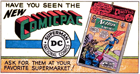
| Handling
individual issues clearly was no option for these
outlets, but by looking at their logistics and
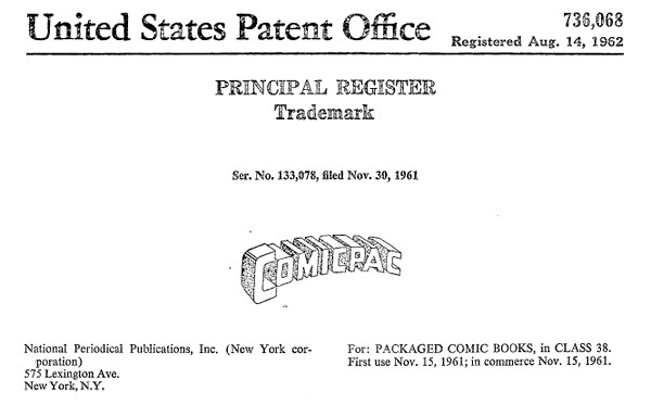
display practices, DC Comics found that the
answer to breaking into this promising new market
was to simply package several comic books
together in a transparent plastic bag - so they
came up with the Comicpac concept in 1961). This resulted in a higher price
per unit on sale, which made the whole business
of stocking them much more worthwhile for the
seller. The simple packaging was also rather
nifty because it clearly showed the items were
new and untouched, while at the same time
blending in with most other goods sold at
supermarkets, which were also conveniently
packaged.
|
|
 |
|
| |
| Supermarkets were even supplied
with dedicated Comicpac racks, which enhanced
the product appeal even more since the bags containing
the comic books could be displayed on hooks in an orderly
and neat fashion. It almost became
an entirely different class of commodity, and
offered parents (and their kids) the
opportunity and convenience to pick up a few comics at
the same time they were doing their general shopping. |
|
|
"DC's focus
[for the Comicpac] was on both the
casual reader and the parents and
grandparents who were looking for
gifts." (Wells, 2012)
DC's
"comicpacks" were a success,
and other publishers quickly started to
copy the concept.
"The
DC [comic packs] program lasted well
over a decade, with pretty high
distribution numbers. The Western
program was enormous - even well into
the '70s they were taking very large
numbers of DC titles for distribution
(I recall 50,000+ copies
offhand)." (Paul Levitz, in
Evanier 2007)
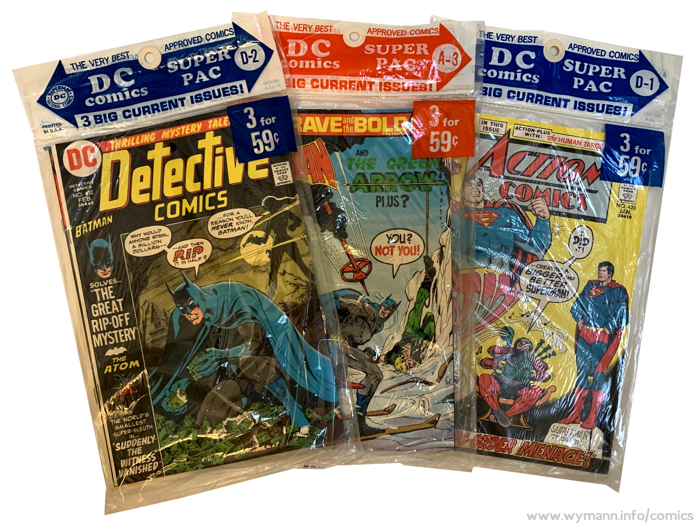
By the early
1970s, DC relaunched their comic packs,
calling them DC Super Pacs, and
they continued to sell well, containing
regular news stand editions.
|
|
|
| |
|
| |
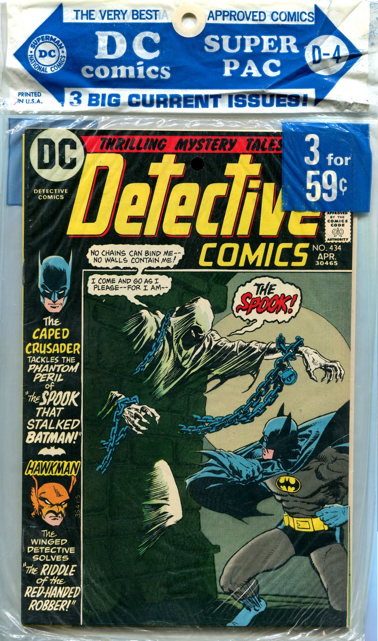
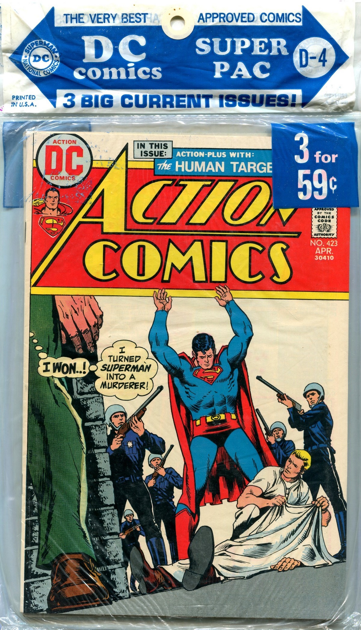
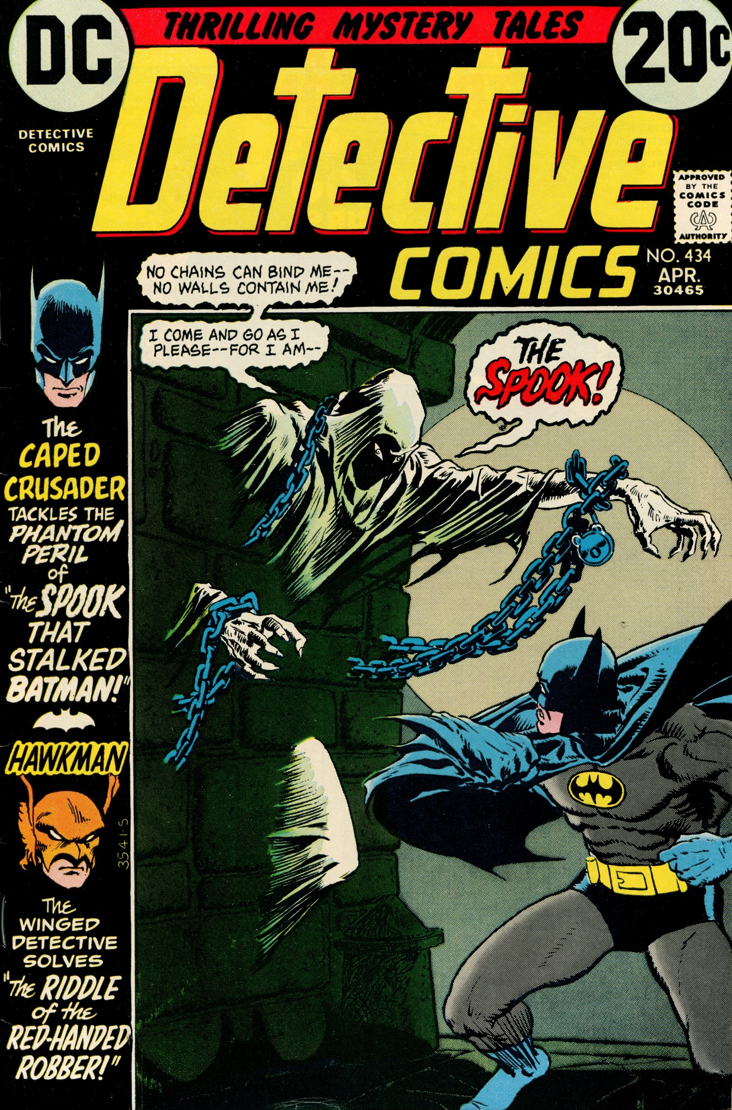
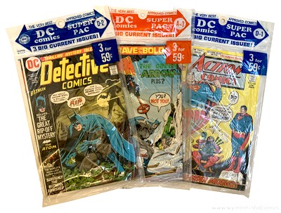
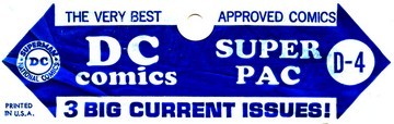
| This April 1973 (D-4) DC SUPER PAC contains Detective
Comics #434, Metal Men #43, and Action
Comics #423. DC handled its
multi-comic packs in a very structured and organised
manner; a D-4 pack from a specific year would carry the
same titles and issues no matter where or when it was
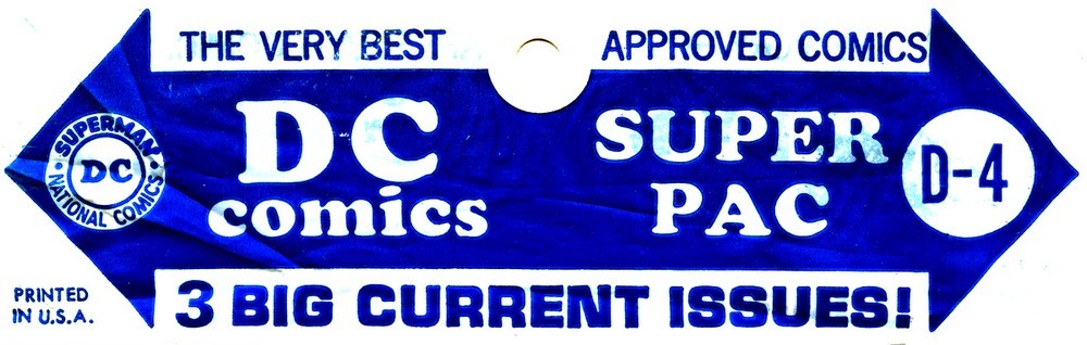
sold (rare packaging errors aside). The digits (1-12)
referred to the month and the letters (A through D)
marked the four different packs produced each month.
"D-4" therefore denotes the fourth April SUPER
PAC, in this case from 1973, containing comic books with
an April cover date or (April/May in the case of a
bi-monthly title). |
| |
| No titles had
permanent slots in the SUPER PACs, although there was a
high level of consistency with DC's flagship characters (the
SUPER PACs of 1973 contained complete runs
of Superman and Batman as well as the
Batman team-up title Brave and the Bold). But since sales points could vary a
lot with regard to their supplies and selection of SUPER
PACs, the availability of specific titles was never
guaranteed - but that was something many comic book readers in the 1970s had
to put up with anyway, whether their comic books came
packaged in a plastic bag or as single issues from a
display or spinner rack. But since DC's editorial at
large still very much embraced the "single issue,
done in one" storyline principle during the early
1970s (rather unlike their major competitor Marvel), it
often didn't even matter in which sequence you read your
copies of Batman or Superman. |
| |
|
| |
|
|
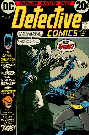
DETECTIVE
COMICS #434
April 1973
(monthly)
On Sale: 27 February 1973
Editor
- Julius Schwartz
Cover - Michael Wm. Kaluta (pencils &
inks)
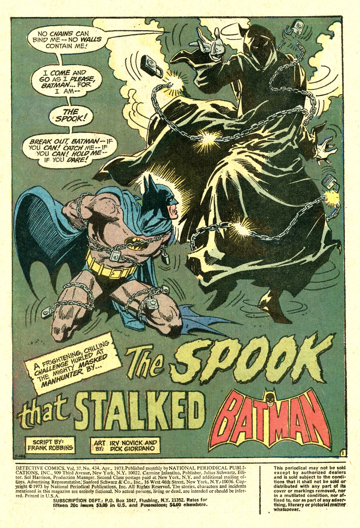
Batman: "The Spook That
Stalked Batman!"
(14.5 pages)
Story -
Frank Robbins
Pencils - Irv Novick
Inks - Dick Giordano
Lettering - Ben Oda
Hawkman: "Riddle Of The
Red-Handed Robber!"
(8 pages)
Story - E.
Nelson Bridwell
Pencils - Rich Buckler
Inks - Dick Giordano
Lettering - Ben Oda
|
|
|
| |
PLOT SUMMARIES - Criminals in Gotham City
are being helped by a mysterious and ghost-like entity
known as The Spook, who seems to uses mystical powers to
get crooks out of prison or tight situations. In order to
stop the Spook, the Batman disguises himself as a
criminal, has himself locked up in prison, and then finds
himself face to face with the Spook... (to be continued).
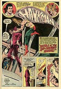
Hawkman is confronted with an odd thief who steals
valuable items from museums in broad daylight with no
attempt to avoid arrest, but no objects can be found on
him once he is at the police station...where is the loot?
|
| |
By 1973, the new course
that writer Dennis O'Neil and artist Neal
Adams had taken the Batman on since early
1970, was firmly established, and with it
came a clear distinction between the
Caped Crusader's two main titles.
"When
I took over the franchise I said
okay, this is the way we do it.
Batman comics will be about superhero
stuff with a lot of action, and
Detective Comics is about the same
character functioning as a
detective." (O'Neil, in
Handziuk 2019)
In general, this
meant that costumed villains would
feature in Batman whereas Detective
Comics focussed more on plain
clothes thugs and evil-doers.

Frank Robbins
(1917-1994)
|
|
But there is no
rule without exception: Detective
Comics #434 features a
villain that seems more ghostly
than human, and who is certainly
costumed: "The Spook...
Mystic Mastermind of the
Impossible". But Frank
Robbins was so well versed at
scripting Batman stories with a
heavy emphasis on detection work
that he made sure it would be the
Caped Crusader's abilities at
deduction and reasoning that
would unmask and bring down the
Spook...
...although
readers would have to wait for
the next issue of Detective
Comics to see that happen
(another exception - no
"done-in-one").
|
|
|
 |
|
|
| |
| Robbins, who was both an artist
and a writer, started working for DC in 1968 and almost
immediately took over scripts for both Batman
and Detective Comics. Together with Dennis
O'Neil and Neal Adams, Frank Robbins along with artist
Irv Novick are credited with returning the Batman to his
darker roots by making him a more brooding character -
and fittingly enough, Novick was assigned to pencil this
first appearance of the Spook as co-creator. |
| |
 |
|
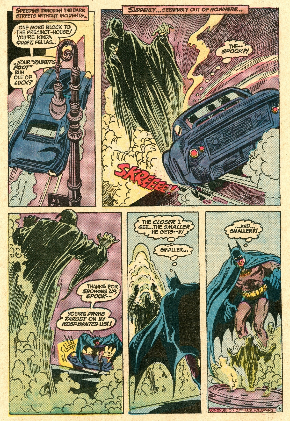
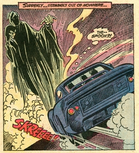
The choice was spot on as Irv
Novick's pencils, along with Dick Giordano's
inks, provide exactly the kind of spooky
atmospheric artwork required to make this tale
work.
Novick spent
almost his entire career in the comic book
industry after graduating from the National
Academy of Design in New York City. In the
mid-1960s DC Comics offered him an unprecedented
freelance contract which guaranteed him the
highest artist's rate plus a steady amount of
work.
In essence,
this meant that as soon as Novick had finished a
job he was to immediately receive another
assignment - resulting in a substantial body of
artwork for DC over the years.
|
|
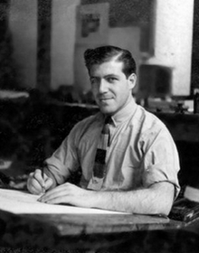
Irv
Novick
(1916-2004)
|
|
| |
| When Carmine Infantino
became a part of DC's management in 1968 he made
sure that Novick became a full-time superhero
penciller, thus providing the artwork for most of
DC's top titles of the genre, including numerous
contributions to Batman and Detective
Comics. |
|
| |
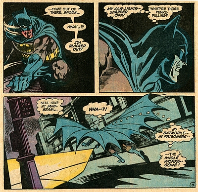
| Irv Novick
had a substantial part in shaping the visuals of
Batman during the late 1960s and all throughout
the 1970s. Retaining his very own style, he
(together with a few other pencillers) fleshed
out the popular culture icon look which Neal
Adams had created, and left a lasting
contribution to the hallmark appearance and
visuals of the Darknight Detective - which still
remain iconic to this day. 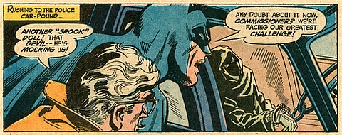
His pencils have a classic touch
in the best sense of the word, and his pictorial
storytelling is fresh and dynamic and even made
some of the lamer plots of the Bronze Age look
interesting.
|
|
 |
|
| |
| Not that the latter quality was
needed in this case, as Frank Robbins seizes on all the
opportunities offered by the ghostly Spook, presenting
readers with a plot that is both baffling and filled with
(nomen est omen) spooky atmosphere. |
| |
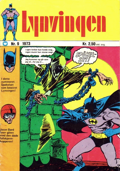
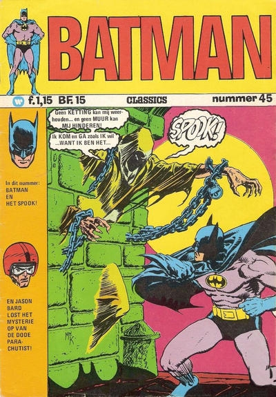
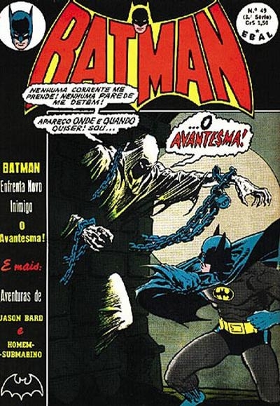
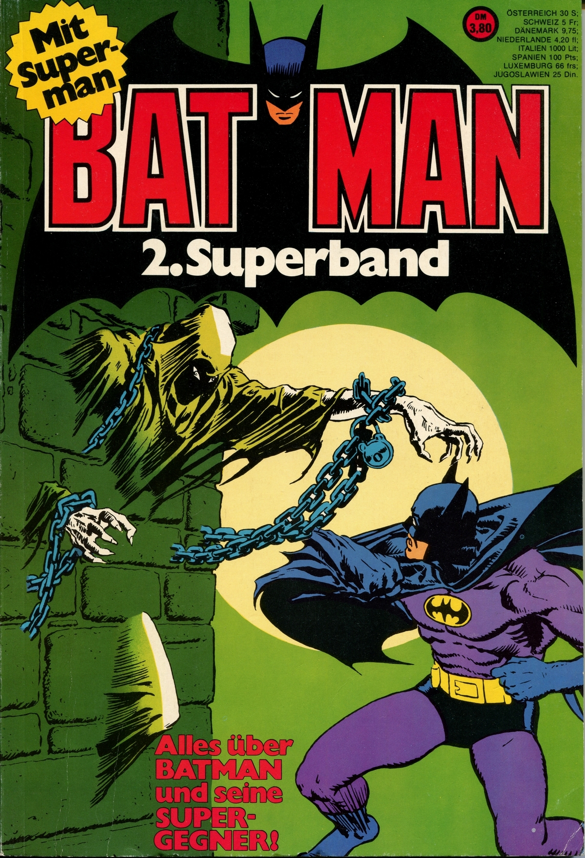
The Spook was
also brilliantly and evocatively
portrayed on the cover of Detective
Comics #434, pencilled and inked by
Michael W. Kaluta.
"The
Batman covers, whether they were [by
Neal Adams] or the odd ones that Mike
Kaluta did during that period, were
set-pieces way above, I think, most
of the rest." (Levitz, in
O'Neil, Adams, Levitz & Evanier
2011)
Michael William
Kaluta (sometimes credited as Mike Kaluta
or MW Kaluta) pencilled and inked three Batman
and eight Detective Comics covers
between 1972 and 1974, all of which
convey a unique feel for the iconic
qualities of Gotham's Caped Crusader.
His cover for Detective
Comics #434 is a prime example of
his ability to evoke and capture the
atmosphere surrounding the Batman, and
rather unsurprisingly it was reused on
several foreign market reprint editions.
|
|

Michael W. Kaluta (*1947)
|
|
|
| |
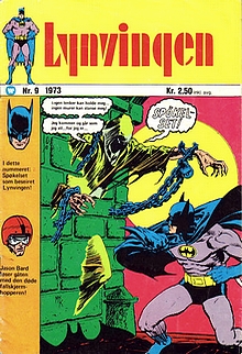 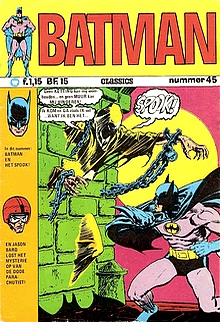 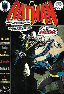 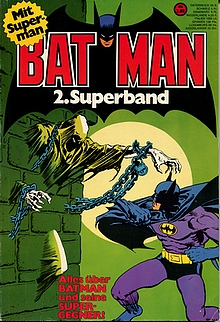
Lynvingen
#9 (Williams Forlag, Norway, December 1973), Batman
Classics #45 (Williams, Netherlands, 1974)
Batman #49 (Editoria Brasil-América, Brazil,
September 1974), Batman 2. Superband (Egmont
Ehapa, Germany, 1975)
|
| |
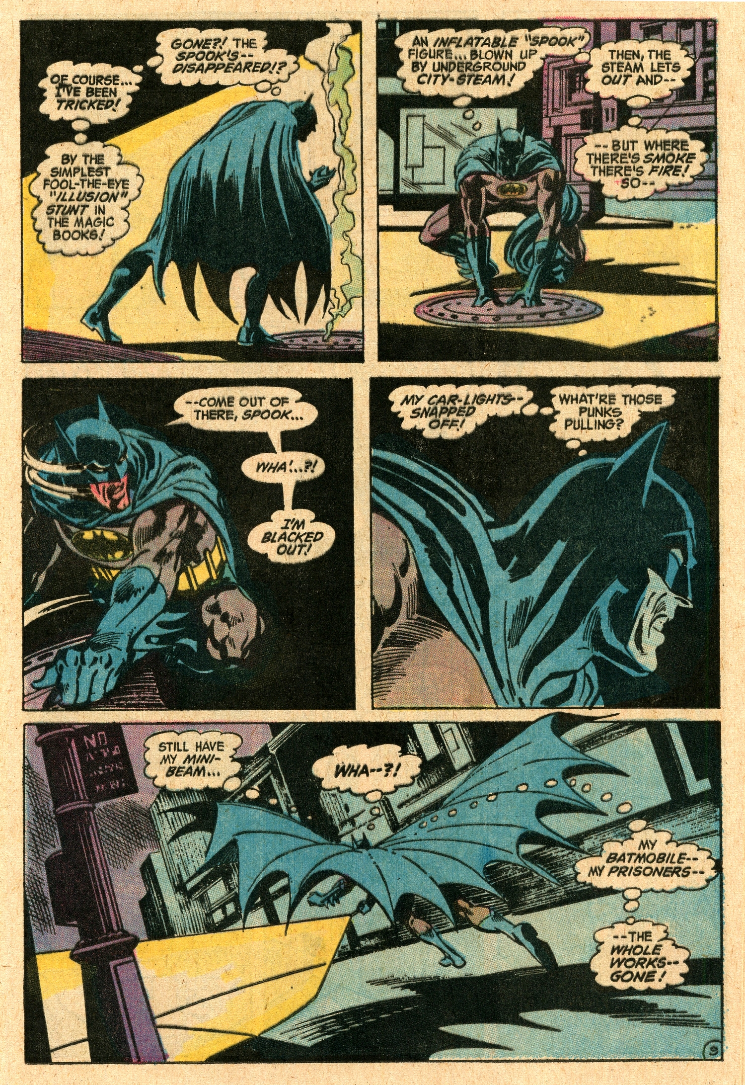
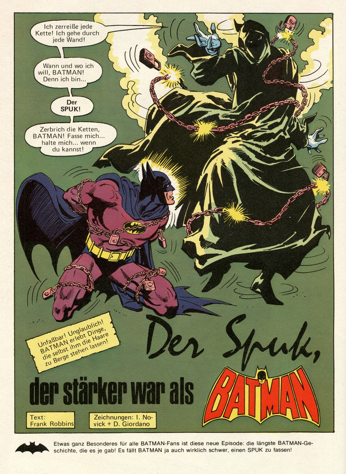
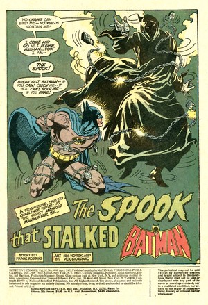
| The Spook, as thought up by Frank
Robbins and visually rendered by Irv Novick for his first
appearance in Detective Comics #434, is actually
an architectural draftsman named Val Kaliban who, in his
professional capacity, tampered with the plans for
Gotham's maximum security prison by constructing a
network of secret passages throughout the prison without
anybody realizing what was going on. |
| |
| Once the prison was
built, Kaliban intended to use the secret
passages to offer convicts a way out if
they payed him. But since he is also a
master escape artist and a trained
hypnotist, this allowed him to create the
illusion of a ghostly appearance which is
further enhanced by his aptitude in
creating and using a wide array of
gadgets and devices, taking his
simulations of various supernatural
effects to a level of near perfection -
and calling himself "the
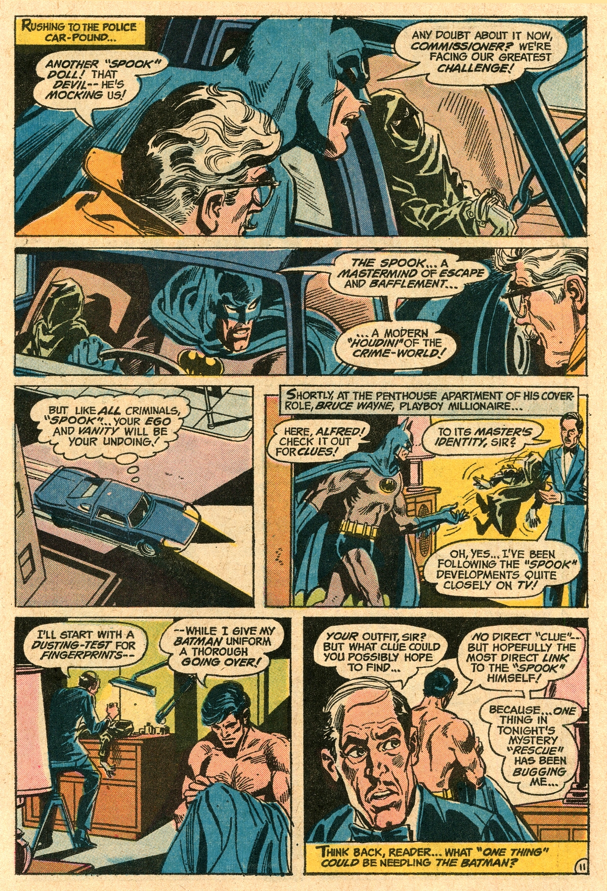
Spook". Having
built up this seemingly unearthly
villain, Robbins then pulls readers back
into the realm of reality by means of the
Batman himself. Always a person of logic,
the Darknight Detective reminds Alfred
(and therefore the readers) to "make
no mistake, we're dealing with a man -
not a spook".
If you liked ghost
stories (and who didn't in the 1970s)
then the Spook was definitely an awesome
Batman villain. However, the character
was only given a handful of appearances
throughout the 1970s in Detective
Comics (#434, #435, #488, #526) and Batman
(#252, #276, #291-294, #304). He then
faded into limbo before returning in 1997
in Legends of the Dark Knight
#90-92. Ultimately (and really only
mentioned here for the sake of
completion) he even ends up being
beheaded by Grant Morrison (well, Damian
Wayne actually) in Batman #657
(November 2006).
One does wonder if
Robbins, in creating the Spook's
background story, was possibly inspired
by real-life serial killer H. H. Holmes
and his 1890s "murder hotel" in
Chicago, with its nightmarish maze of
hidden passages (Little, 2025).
|
|
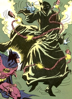
Detail
from the splashpage of Batman 2.
Superband (Egmont Ehapa, Germany,
1975)
|
|
|
| |
But regardless, his writing boils down to one thing:
"When Robbins stopped
trying to [copy Stan Lee], he turned out to be a
pretty good writer. In fact, he became my favorite
Batman writer of the period and I was pretty fussy
about Batman writers." (Evanier, 2023)
|
| |

E. Nelson Bridwell
(1931-1987)

Rich Buckler
(1949-2017)
|
|
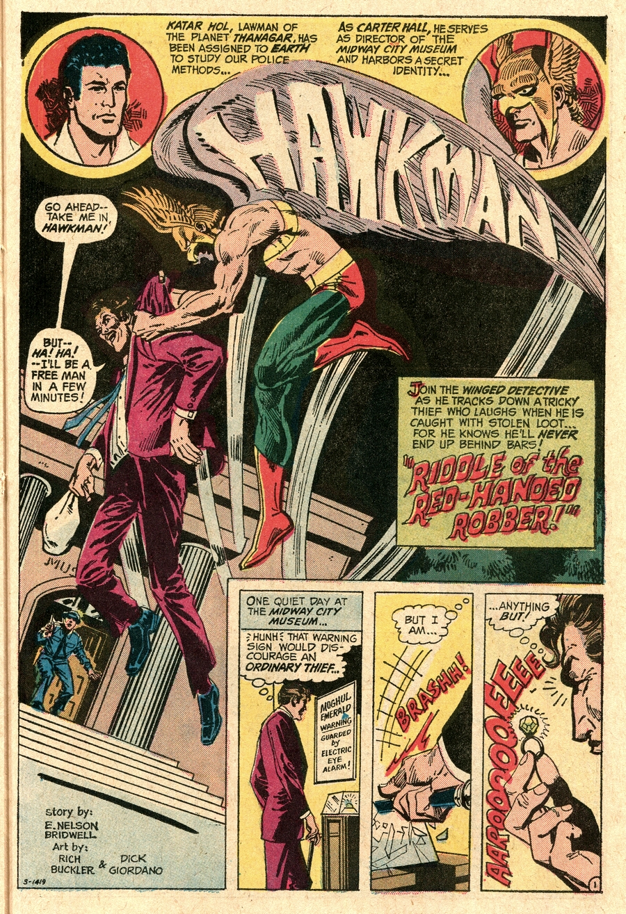
The back-up
feature in Detective Comics
would change frequently during
the early 1970s, but a common
theme of detective work was
maintained. In this issue, it
is the turn of Hawkman, the
"Winged Detective" (who
is actually Katar Hol, a lawman
from the planet Thanagar, who has
been assigned and sent to Earth
to study our police methods) to
solve the "Riddle of the
Red-Handed Robber".
| The
story runs for a mere 8
pages and was penned by
E. Nelson Bridwell, whom
Mark Evanier has called
"one of the great
unsung heroes of the
comic book industry"
(Evanier, 2011). He
was mainly an assistant
editor at DC in the
1960s, 1970s and 1980s,
and sometimes also took
on writing chores.
"He was often
more qualified than those
he assisted and he
frequently did their jobs
for them or caught their
mistakes."
(Evanier, 2011)
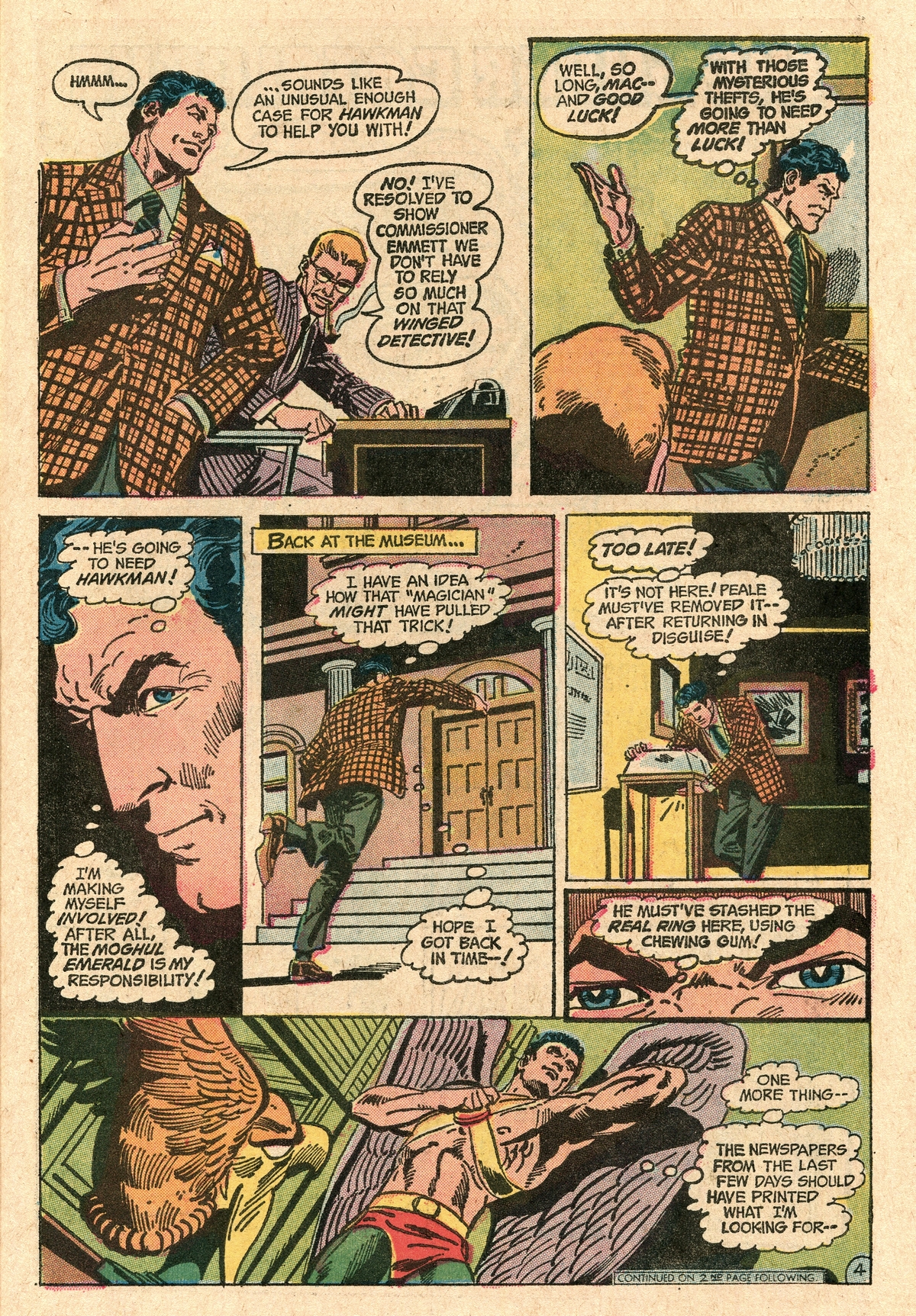
The tale involving
Batman and the Spook set
the bar rather high, and
the Hawkman story comes
across as being rather
mediocre (unless maybe
you're a die hard Hawkman
fan).
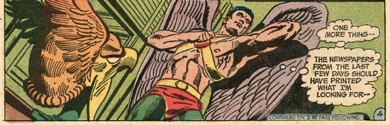
Rich Buckler's artwork
is solid, but it can't
carry the backup feature
to a higher level.
|
|
 |
|
|
|
|
| |
|
| |
| |
|
| |
|
|
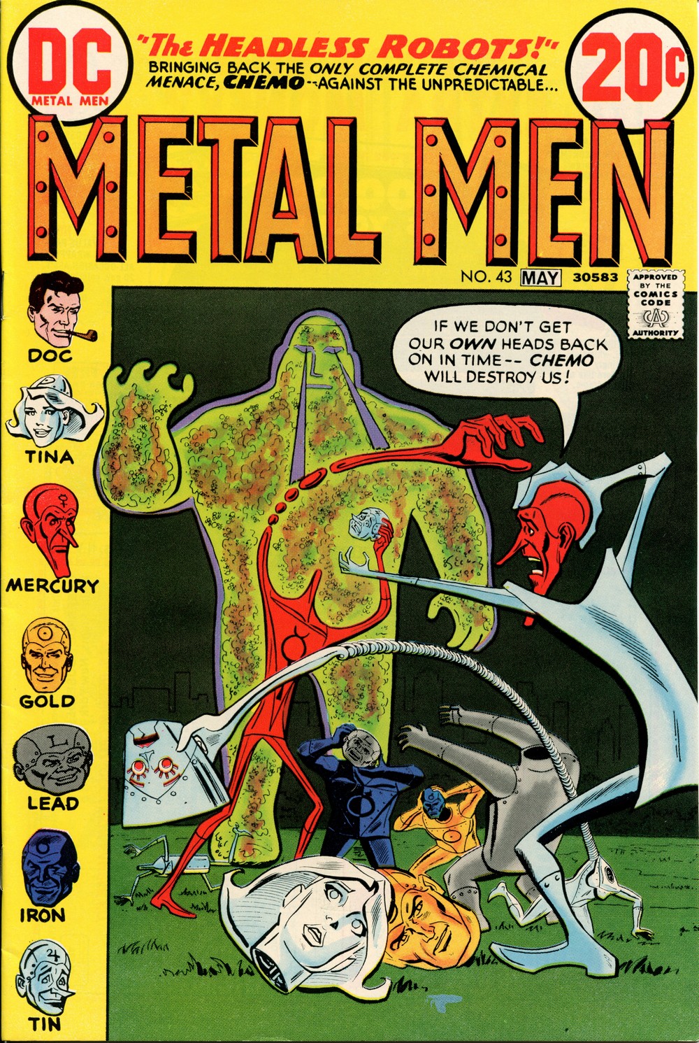
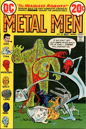
METAL MEN #43
April/May
1973
(bi-monthly)
On Sale: 27 February 1973
Editor - Jeff
Rovin
Cover - Ross Andru (pencils)
& Mike Esposito (inks)
reprinted (adding the yellow
frame) from Metal Men
#14 (June/July 1965)
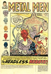
"The
Headless Robots" (22.3
pages)
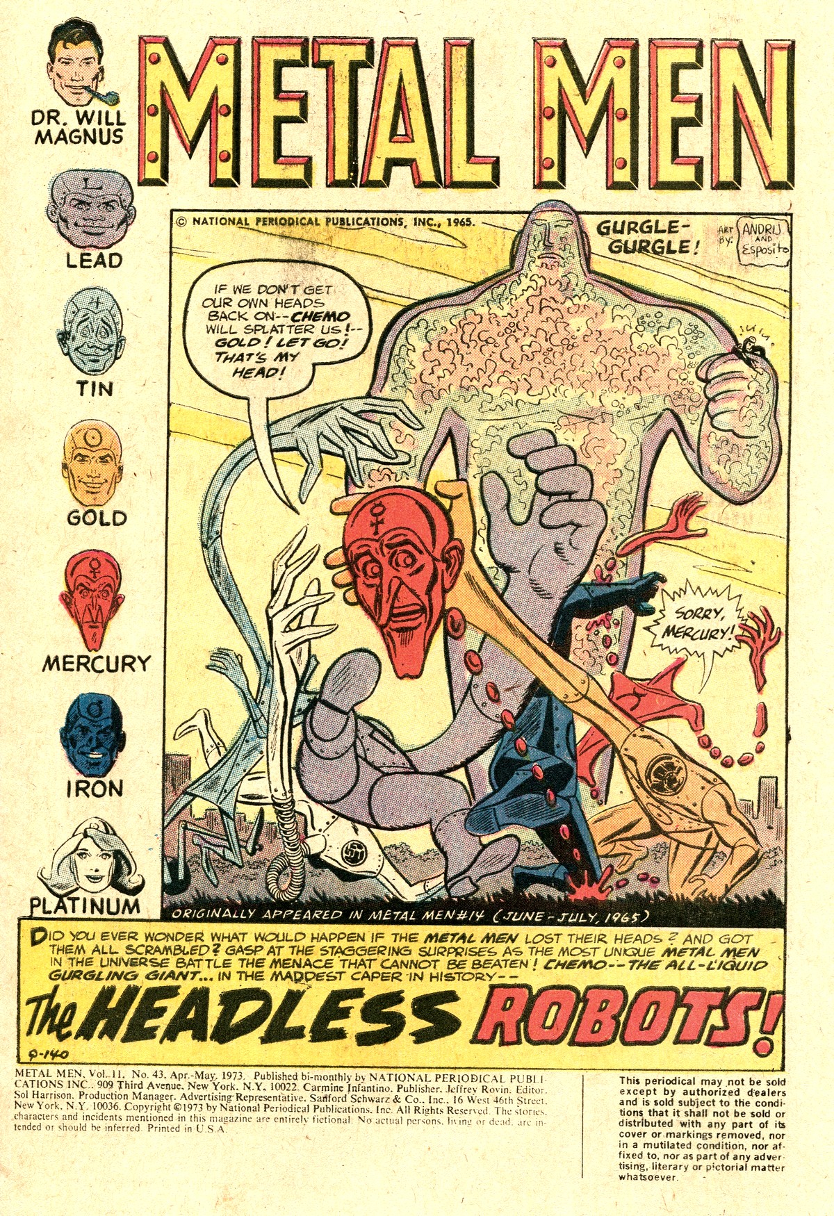
Story
- Robert Kanigher
Pencils - Ross Andru
Inks - Mike Esposito
reprinted from Metal Men
#14 (June/July 1965)*
*The bottom two
thirds of the original page 16,
the first and third panels of the
original page 16, and the
original page 18 were removed for
this reprint
PLOT
SUMMARY
- The Metal Men fight and defeat
Chemo for the second time.
|
|
|
|
| |
| A group of six advanced,
artificially intelligent robots, the Metal Men first
appeared in Showcase #37 (March/April 1962).
Created by scientist Dr. Magnus, they are named after
specific metals (Gold, Iron, Lead, Mercury, Tin, and
Platinum - the only female robot, also called
"Tina") and possess abilities that reflected
the traits of their namesake metal. |
| |
| The characters were given their
own title in May 1963, which ran on a bi-monthly
publication schedule but dropping sales had the
title cancelled after Metal Men #41 (December
1969). In March 1973, the title was brought back
(Metal Men #42) for a total of mere
three issues, all of which reprinted earlier
material). The title then
again went on a hiatus until Metal Men
#45 (May 1976), returning with original material
and lasting until issue #56 (March 1978) when it
fell victim to the infamous DC Implosion.
Reviving Metal Men
for three issues of reprint material from the
mid-1960s was most likely part of DC's attempt to
fight back at Marvel's policy of putting out a
slew of titles (in an attempt to increase their
slice of the market and push the competition off
the nwes agent shelves and displays). As with
many other titles thrown out by DC during that
period, Metal Men didn't work - and DC's
head Carmine Infantino himself knew exactly why.
"The DC books
were very sterile-looking in those
days." (Infantino & Spurlock,
2001)
|
|
|
|
| |
|
|
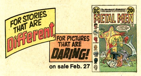
What Infantino
was alluding to was the fact that DC was missing
the boat with far too many of its featured
characters in comparison to their competition -
and no amount of advertising hyperbole (the
in-house ad comes from Detective Comics
#434) could change that. Whilst the story could
be labelled different in a sense
("antiquated" might have been a better
word for it), the pictures (i.e. artwork)
definitely weren't daring - if anything, they
reflected DC's sanitized house style of the
1960s.
Metal Men would make a
comeback in DC's comicpacks, with issues #50
(included in the February 1977 B-2 "Dynamite
Comics Pack") and #52 (April 1977 D-4).
|
|
| |
| |
|
| |
|
|
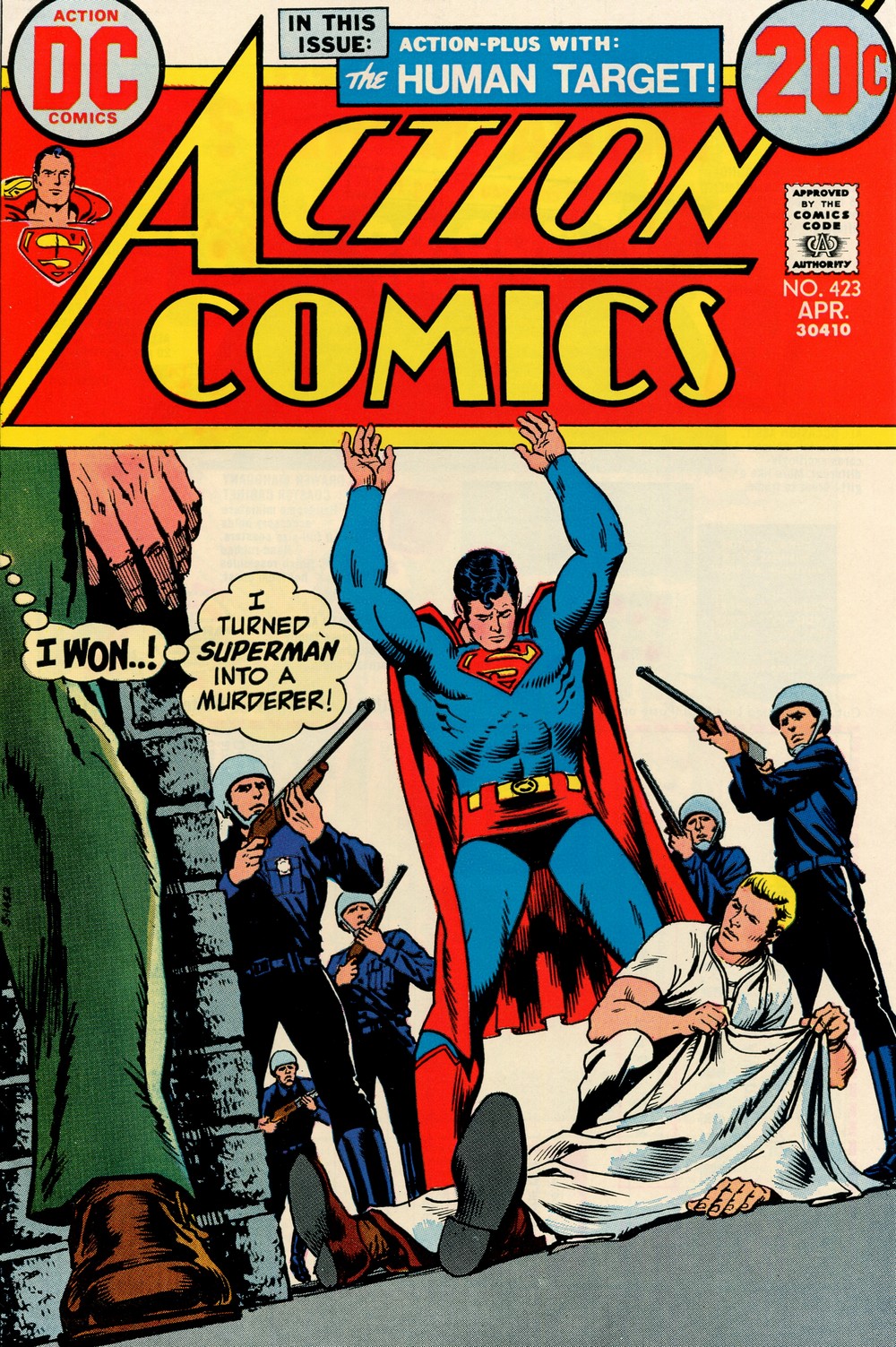
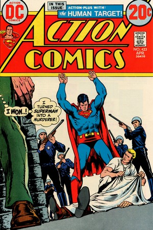
ACTION
COMICS #423
April
1973
(monthly)
On Sale: 27 February 1973
Editor -
Julius Schwartz
Cover - Nick Cardy (pencils &
inks)
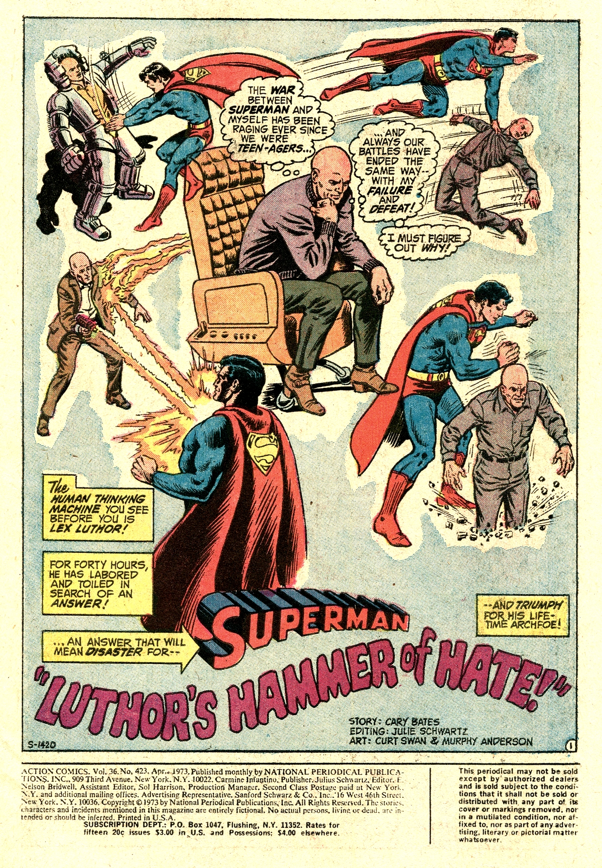
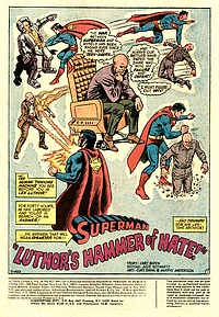
SUPERMAN:
"Luthor's Hammer Of
Hate" (14.5 pages)
Story - Cary Bates
Pencils - Curt Swan
Inks - Murphy Anderson
Lettering - Ben Oda
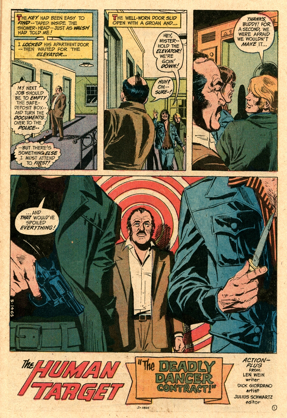
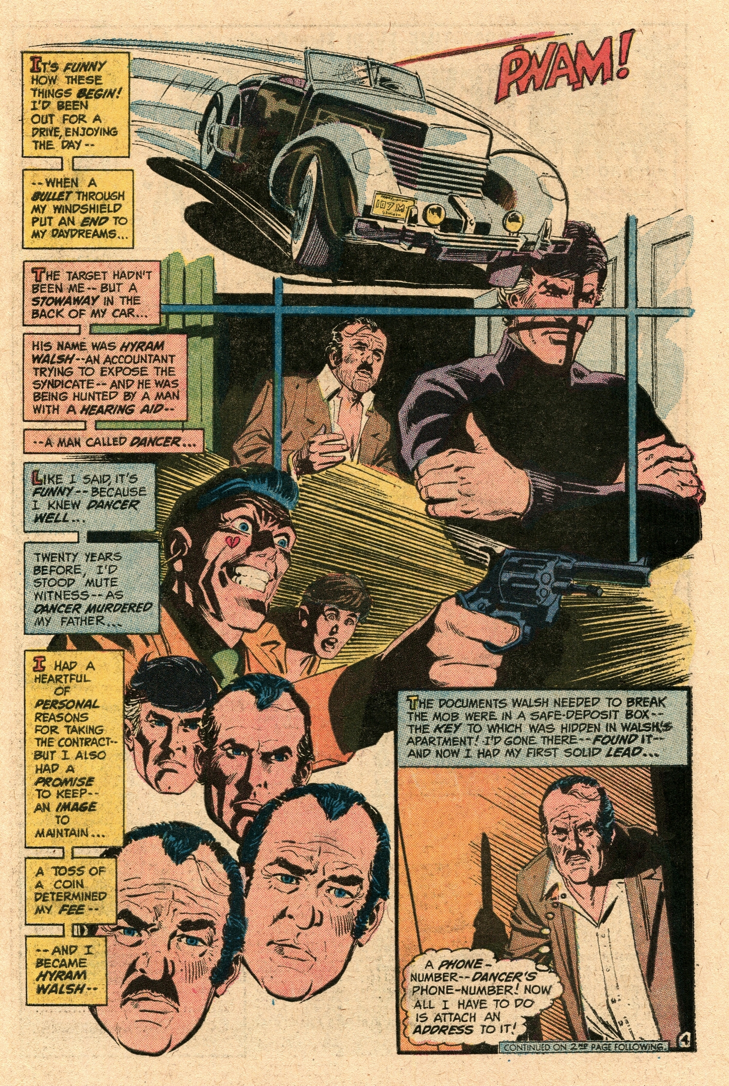
HUMAN
TARGET: "The Deadly Dancer
Contract!" (8 pages)
Story - Len Wein
Pencils & Inks - Dick
Giordano
PLOT
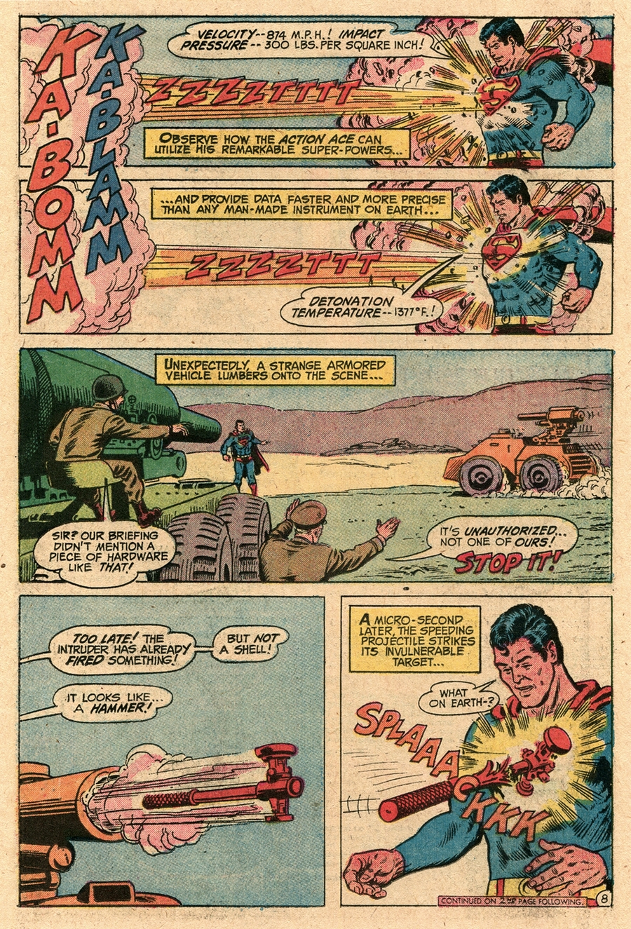
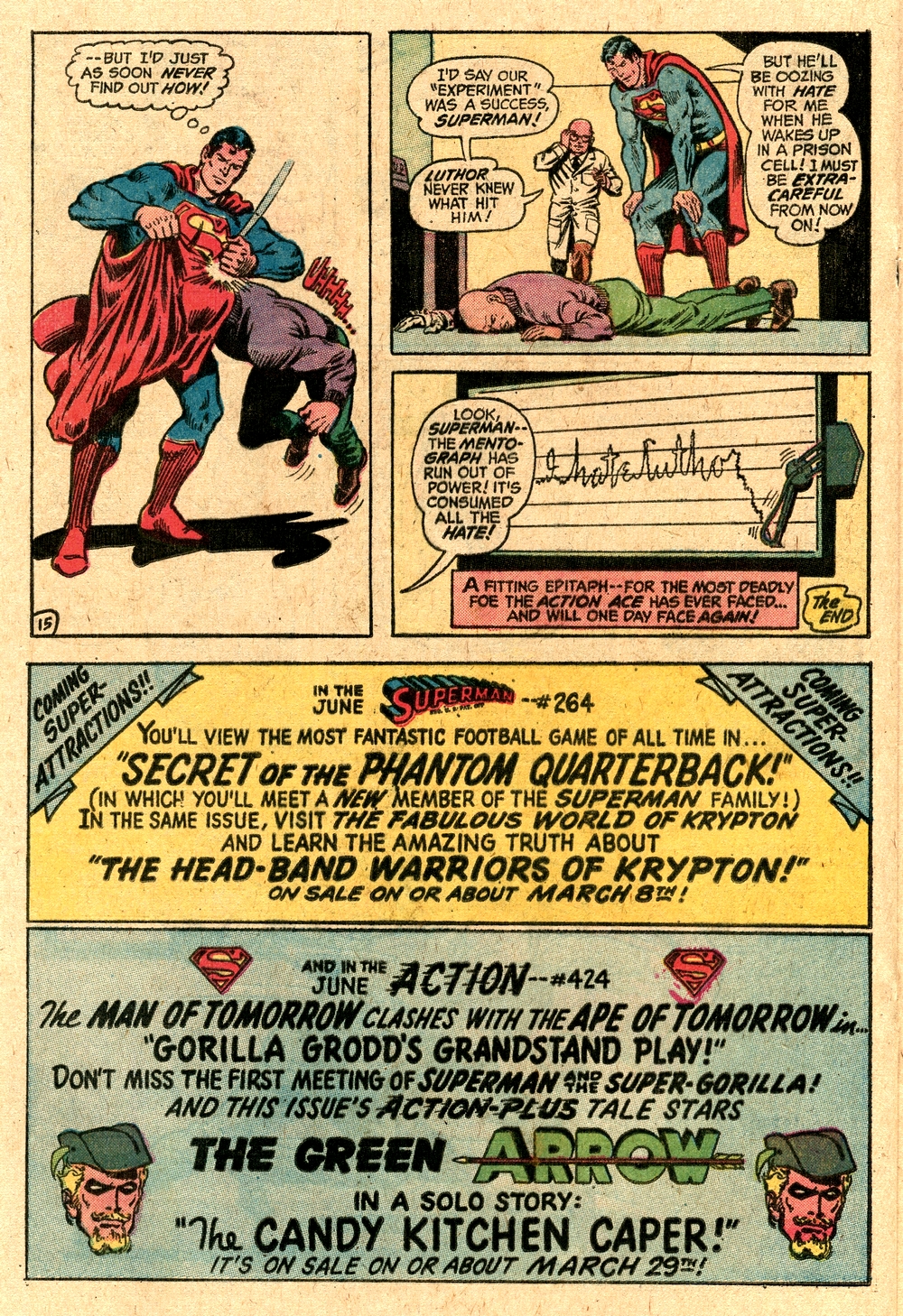
SUMMARIES - Luthor
finds a means of transferring his
hatred for Superman via an
energized hammer into Superman
himself, but the Man of Steel is
back in control when he in turn
transfers his anger to the
Mento-Graph, which then burns
itself out with rage / The Human
Target poses as an accountant
informing on the mob
|
|
|
|
| |
|
| |
| When Action Comics #423
hit the newsstands (and as part of the 1973 B-4
Super-Pac), the Man of Steel's adventures were
commonly in the hands of writer Cary Bates,
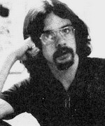
taking turns with Elliot Maggin. Cary Bates
belonged to a number of DC Comics fans who turned
writers at a very young age in the late 1960s and
early 1970s, starting to submit ideas for comic
book covers at the age of 13 (some of which were
bought and published) and selling stories to DC
when he was just 17 years old (Eury, 2013).
But whilst the
scripting of Superman and other major DC
characters was entrusted to younger newcomers
such as Bates and Maggin, the artists involved
belonged to the previous generation of DC
staffers who had been working for the company for
decades.
This in essence
teamed up former fans with the comic book
pencillers and inkers whose work they had enjoyed
as young readers, and the age gap was always
there - most visibly so when it came to attire.
|
|
 |
|
| |
Cary
Bates
(*1948)
|
|
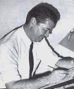
Whereas
Bates and Maggin sported long hair and casual
clothes, veterans such as Curt Swan and Murphy
Anderson would always be seen wearing shirts and
dark ties. The relaxed appearance of the younger
staff was only accepted reluctantly by the
veteran DC editors, and there were certain
limits.
"Whenever
I came up to the DC offices to see [Mort
Weisinger], he insisted I wear a tie (...)
Mort once told me he didn't want Jack
Liebowitz (DC's owner back in the day) to
walk by his office to see him talking to
some"hippie". But on the plus side
at least he didn't ask me to get a
haircut." (Bates in Stroud, 2011)
Long-standing
Superman artists Curt Swan (pencils) and Murphy
Anderson (inks) both produced work that not only
conformed to the DC house style but in many ways
shaped it.
"DC
artists were forced to work within an
established house style that governed the
page layout as well as the look of the
artwork. Editor Julie Schwartz's motto was
'if it's not clean, it's worthless'."
(Tucker, 2017)
By
the time the early 1970s rolled around this was
relaxed a bit - but there was trouble
brewing in the Superman Universe.
Julius Schwartz had only
taken over the editorial reigns of Action
Comics two issues previously, and he wasn't
happy at all with its main character, the Man of
Steel.
|
|

Curt
Swan
(1920-1996)
Murphy
Anderson
(1926-2015)
|
|
"Having spent
much of the previous decade merely observing
from the cultural sidelines, the
now-thirtysomething Superman was hit hard by
the disillusionment that seized the country
in the 1970s (...) Marvel heroes bickered and
questioned and agitated - they were agents of
chaos, and they looked like the kids who read
them. Superman, on the other hand, dutifully
imposed order, and he looked like a
cop." (Weldon, 2013)
And Schwartz wasn't alone
in feeling that the character had somewhat fallen
out of sync with the times.
"O'Neil
shared his editor's ambivalence, because he
figured that such a high-profile character
would come with too many corporate strings
attached. He also found it difficult to get
excited about a character who could see
through time and blow out a star. "How
do you write stories about a guy who can
destroy a galaxy by listening hard?"
O'Neil famously joked." (Weldon,
2013)
Together, Schwartz and
O'Neil reached the conclusion that the only way
forward was to "depower" Superman -
readers needed to see him struggle.
|
|

Julius
Schwartz
(1915 - 2004)
|
|
| |
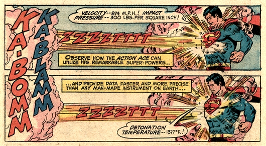
| And so, they took the man
of Steel's well-known major weakness off the
board as all Kryptonite on Earth was turned into
iron by a freak scientific experiment in Superman
#233 (January 1971). At the same time, Superman's
powers started to mysteriously fade. It was a
nice idea, but there simply were too many
"super-this" and "super-that"
abilities tied into Superman as a character, and
Clark Kent was still constantly having to foil
the discovery of his dual identity. |
|
| |
 |
|
At the end of
the day, not too much changed after all - except
O'Neil didn't want to write Superman anymore
(Freiman, 2009). Unless you were a die-hard
Superman fan, a lot of those stories didn't
really seem to go anywhere relevant. In
comparison to Marvel's output, the Superman fare
also seemed to be very much on the meek and mild
side.
Not surprisingly, many readers bought Action
Comics not because they were fans of
Superman, but because of the second features
appearing in the title (Kingman, 2013) - and Action
Comics #423 most likely fell square into
this segment of appeal with most readers.
|
|
| |
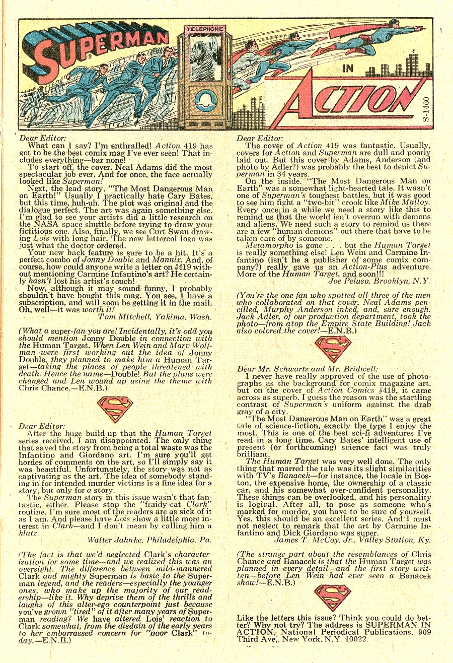
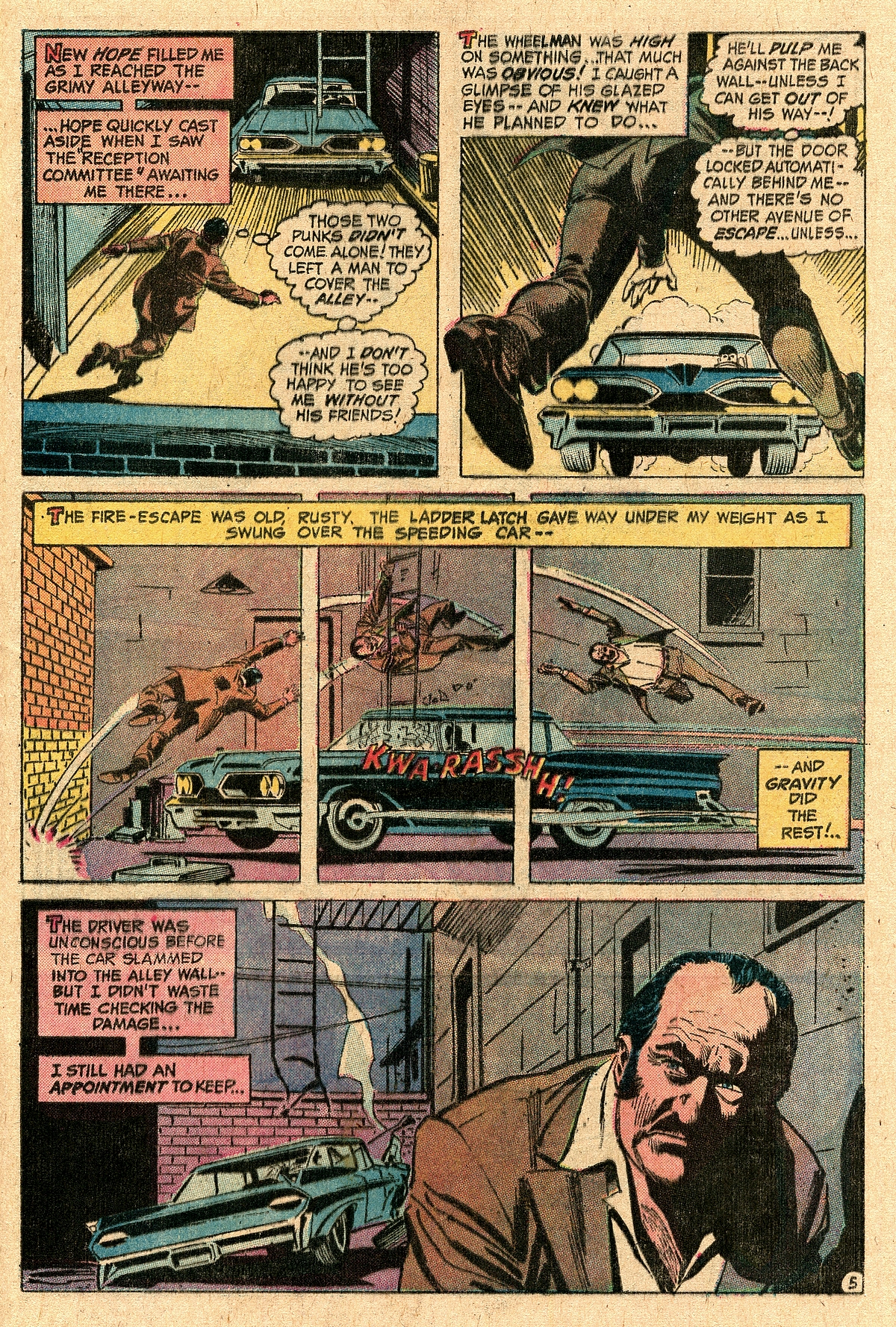
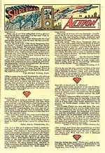
| The Human Target had only been introduced in Action
Comics #419 (December 1972), and readers'
reactions featured on the letters page in Action
Comics #423 were mixed, ranging from outright
enthusiasm to a sense of disappointment. Created by Len
Wein and Carmine Infantino, the Human Target certainly
provided some non-superhero interest, somewhere close to
the spi-fi genre. |
| |
|
| |
| The Human Target would leave Action
Comics as back-up feature after issue #432 in
February 1974 and move on to become the backup in Detective
Comics until 1982 (with a few appearances in Brave
and the Bold), before switching to Batman
until late 1982. In 1999 he was given his own book in the
Vertigo imprint which clocked up 21 issues and ran until
2005, and in 2010 Len Wein returned to the character for
a DC mini-series as the Human Target also became a Fox TV
series which ran for two seasons in 2010/11. In 2016, the
character featured in season 5 of Warner Brothers' TV
series Arrow, before returning in 2021 for a
mini-series of 12 issues in DC's "Black Label"
imprint. |
| |
| |
|
| |
| There were many things that set
DC apart from Marvel in the early 1970s, but one very
salient aspect was DC's lack of any regular editorial
feature across its titles through which editors would
communicate with their readership (as Marvel and Stan Lee
did with their famous Bullpen Bulletins); DC's
interaction with its fans and readers was limited to the
letters pages, whilst plugs for other titles were
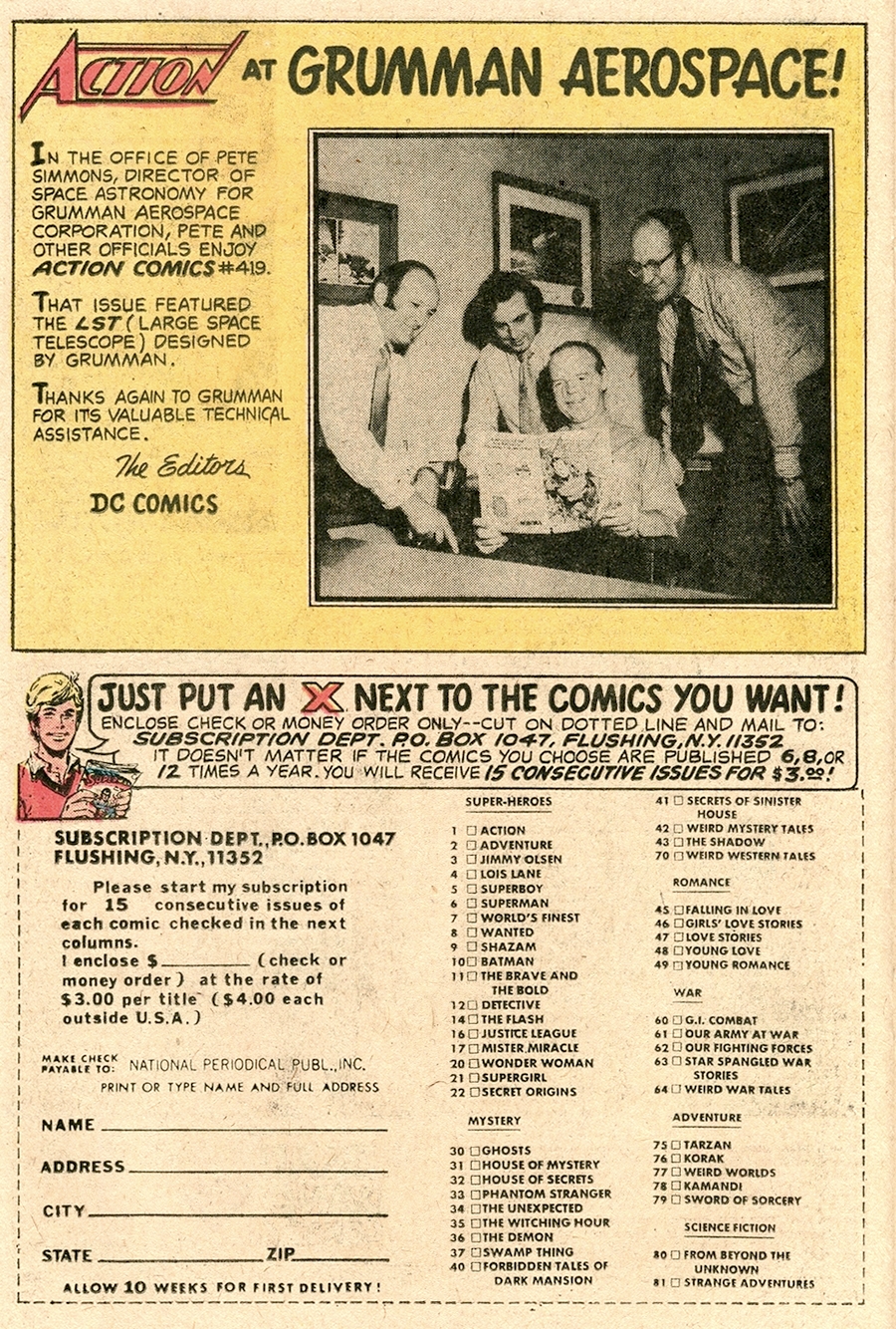
essentially restricted to in-house ads. If you picked up
this April 1973 D-4 SuperPac, you came across the
following. |
| |
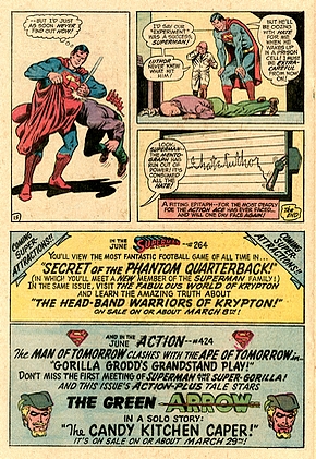 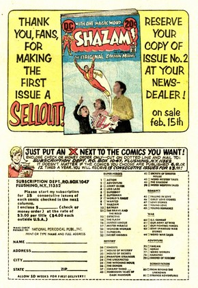 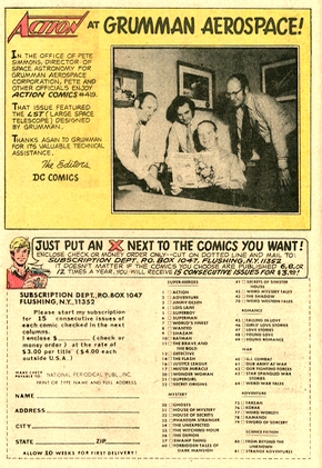
Action Comics
#423 (left), Metal Men #43 (center), Action
Comics #423 (right)
|
| |
|
| |
| FURTHER
READING ON THE THOUGHT
BALLOON |
| |
| |
 |
|
"Comic
packs" not only sold well
for more than two decades, they
also offer some interesting
insight into the comic book
industry's history from the 1960s
through to the 1990s. There's
more on their general history here. |
|
|
|
| |
|
|
An overview
and analysis of all the 1973
Super Pacs is available
here. |
|
|
|
| |
|
|
You can read
more about the 1973 "war of
the shelves" between Marvel
and DC here. |
|
|
|
| |
| |
| |
|
| |
BIBLIOGRAPHY
| |
| EURY Michael (2013) "A
Super Salute to Cary Bates", Back Issue!
#62, TwoMorrows EVANIER
Mark (2007) "More on Comicpacs", News From Me,
published online 2 May 2007
EVANIER
Mark (2011) "E.N.B.
Remembered", News From Me,
published online 24 October 2011
EVANIER
Mark (2023) "About
Frank Robbins – Part 1 of Three", News From Me,
published online 29 September 2023
FREIMAN Barry
M. (2009) "Exclusive
Interview with Elliot S! Maggin", supermanhomepage.com,
published online January 2009
HANDZIUK Alex
(2019) "An
Interview with Legendary Creator Denny O'Neil -
The father of Modern Day Batman", cgmagonline.com,
published online 16 March 2019
INFANTINO Carmine,
with J. David Spurlock (2001) The Amazing
World of Carmine Infantino. An Autobiography,
Vanguard
KINGMAN
Jim (2013) "The Ballad of Ollie and
Dinah", in Back Issue #64 (May
2013)
LITTLE
Becky (2025) "Did
Serial Killer H.H. Holmes Really Build a ‘Murder
Castle’?", history.com,
pubölished online 23 January 2020, updated 28
May 2025
O'NEIL
Denny, Neal Adams, Paul Levitz & Mark Evanier
(2011) "Pro2Pro: Dark Rebirth", Back
Issue #50, TwoMorrows Publishing
STROUD
Bryan (2011) "Cary
Bates Interview", wtv-zone.com,
published online 14 October 2011
TUCKER
Reed (2017) Slugfest: Inside the Epic
Fifty-Year Battle between Marvel and DC,
Sphere
WELDON
Glen (2013) "The
70s Were Awkward for Superman", The
Atantic, 3 April 2013
WELLS
John (2012) American Comic Book Chronicles:
The 1960s (1960-1964), TwoMorrows Publishing
|
|
| |
| |
|
| |
|
| |
|
| |
(c) 2025
uploaded to the web
14 December 2025
|
| |
|
| |
|