 |
 |
|
BATMAN,
FLASH & SUPERMAN
BACK
TO BACK IN A
DECEMBER
1972 DC SUPER PAC
|
|
|
|
| |
|
| |
|
| |
|
| |
DC
COMICS SUPER-PACs |
|
Even in the early
1960s, the comic book industry
realized that in spite of the
hugely successful comeback of the
superhero genre (which had been
clinically dead for most of the
1950s) and the subsequent streak
of new creativity and enthusiasm
it generated, its traditional
sales points were fading away.
Small stores that had carried
comic books were pushed out of
business by larger stores and
supermarkets, and newsagents
started to view the low
cover prices and therefore tiny
profit margins comics had to
offer as a
nuisance. Many ideas on how
to turn these developments around
were put forward by different
publishers, but the most
successful concepts strived to
open up new sales opportunities
and markets and thus tap into a
new customer base.
|
|
|
|
| |
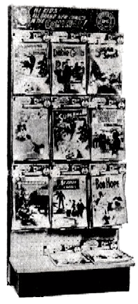
| One place these potential
buyers could be found was the growing number of
supermarkets and chain stores. But in order to be able to
sell comic books at supermarkets, the product would have
to be adjusted. |
| |
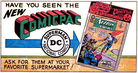
| Handling
individual issues clearly was no option for these
outlets, but by looking at their logistics and
display characteristics, DC Comics (who came up
with the Comicpac concept in 1961) found
that the answer to breaking into this promising
new market was to simply package several comic
books together in a transparent plastic bag. This resulted in a higher price
per unit on sale, which made the whole business
of stocking them much more worthwhile for the
seller. The simple packaging was also rather
nifty because it clearly showed the items were
new and untouched, while at the same time
blending in with most other goods sold at
supermarkets which were also conveniently
packaged.
|
|
 |
|
| |
| Outlets were even supplied with dedicated Comicpac
racks, which enhanced the product appeal even more since
the bags containing the comic books could be displayed
on rack hooks in an orderly and neat fashion.
It
didn't really matter therefore that buying these three
comic books in a comicpack for say 59¢ (rather than from
a newsagent for 60¢ in that
case) clearly presented no real
bargain - it was the opportunity and convenience to pick
up a few comics at the same time parents and adults did
their general shopping. Neatly packaged, it almost became
an entirely different class of commodity.
|
| |
|
|
DC's
"comicpacks" were, in a word, a
success - so much so that other
publishers quickly started to copy it.
"DC's
focus [for the Comicpac] was on both
the casual reader and the parents and
grandparents who were looking for
gifts." (Wells, 2012)
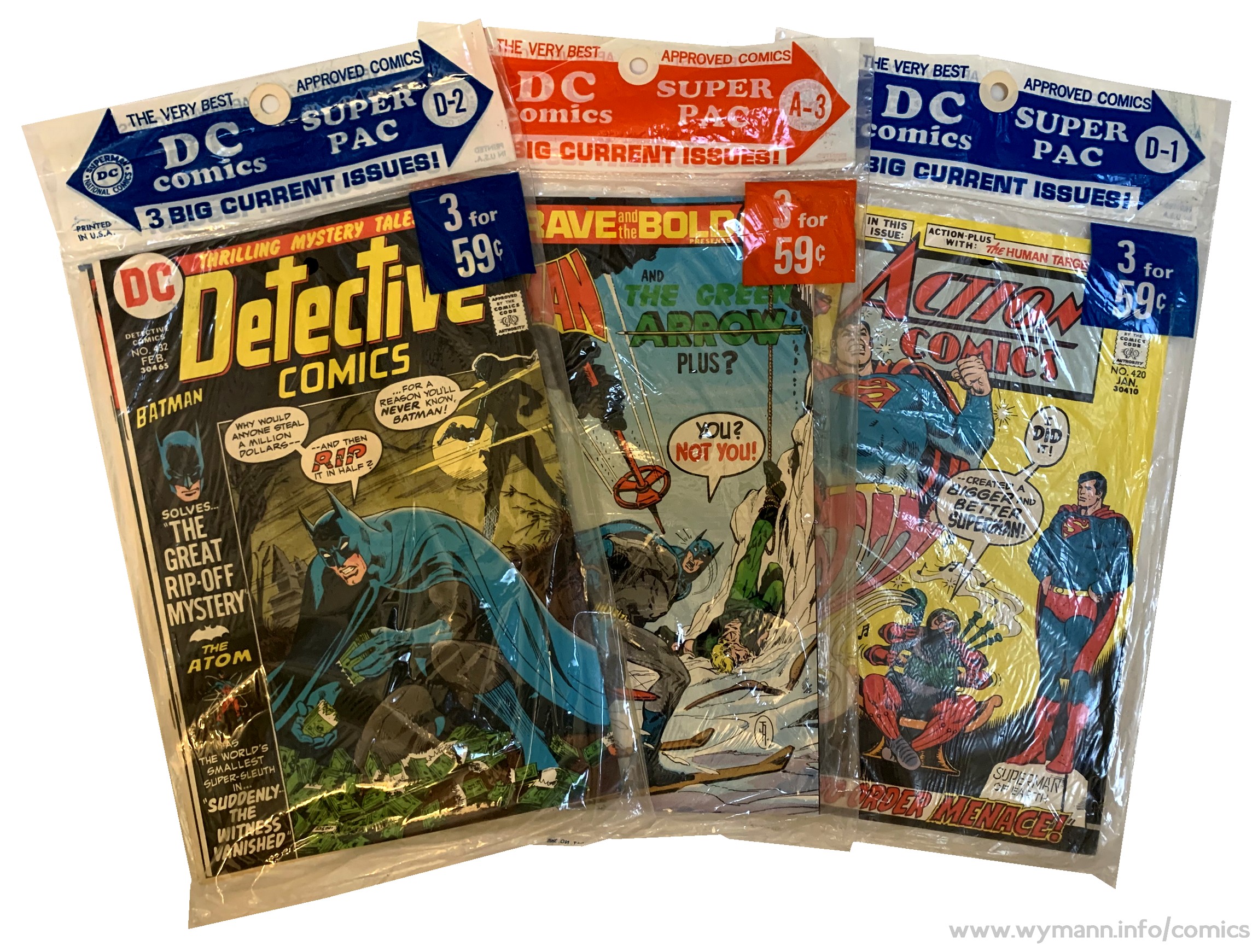
By the early
1970s, DC relaunched their comicpacs,
calling them DC Super Pacs, and
they continued to sell well.
"The DC [comic packs]
program lasted well over a decade,
with pretty high distribution
numbers. The Western program was
enormous - even well into the '70s
they were taking very large numbers
of DC titles for distribution (I
recall 50,000+ copies offhand)."
(Paul Levitz, in Evanier 2007)
|
|
|
| |
| Unlike comic books distributed to news stands and
other traditional outlets, comicpacks were
non-returnable. Bags that didn't sell were thus the
retailer's problem, not the publisher's (leading some
distributors and retailers - who most likely had
previously rigged the returnable comic scheme, e.g. by
selling comic books without their covers - to simply
split the packs open and return the loose comics). |
| |
| The only way to stop such illegal
behaviour was to make comic books contained in
comic packs distinguishable from regular news
stand editions - and Western, the largest
distributor of comic packs, did just that as of
1972 by introducing their logo on the cover. DC
titles distributed by Western in their own
comicpacks featured the Western "smiling
face" logo instead of the DC roundel; the
covers would also not show the issue number and
the month.
DC's own comicpacks, however, continued to
contain regular newsstand editions only
throughout the 1970s.
|
|
 |
|
| |
|
| |
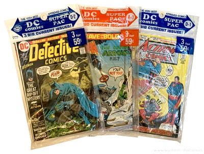
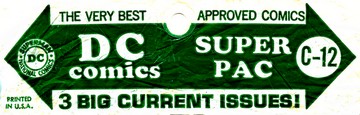
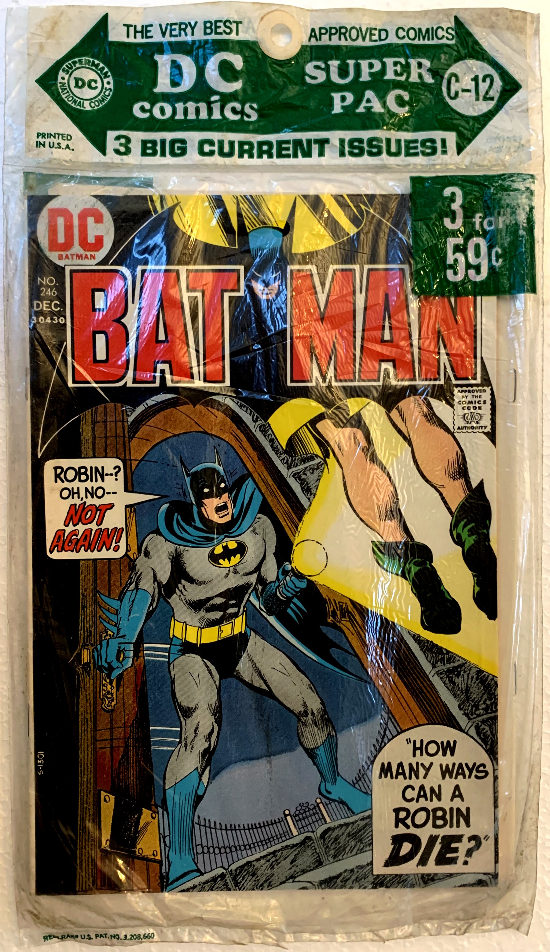
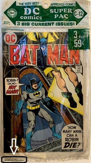
| This December (C-12) 1972 DC SUPER PAC contains Batman #246, Flash
#219, and World's Finest #215, and even
though these titles feature major DC characters (Batman,
Superman, Flash, Green Lantern, and Green Arrow), none of
them was published monthly at the time. As a consequence,
only Batman #246 carries a December cover date
(the title was published eight times a year, including in
December), whereas Flash #219 and World's
Finest #215 display a January cover date (in the
case of bi-monthly publication, DC would print the second
month on the cover, thus making the title appear
"new" on shelves and racks for a longer period
of time). Right from the start in
1961/62, when DC Comics launched the Comicpac,
all of their multi-comic packs were reference-numbered
using a letter plus digit, e.g. B-3. And since DC wasn't
just filling plastic bags at random with any comic books,
a B-3 pack from a specific year would carry the same
titles and issues no matter where or when it was sold
(rare packaging errors aside).
|
| |
|
|
By
1964 the digit would refer to the month,
i.e. A-1 and B-1 would both feature comic
books with a January cover date (or
January/February in the case of
bi-monthly titles), and four packs (A
through D) per month were the rule from
mid-1972 to 1978 (when DC ended their own
comicpacks). "C-12"
therefore denotes the third December
SUPER PAC, in this case from 1972.
|
|
|
| |
| |
| No titles had truly
permanent slots in the SUPER PACS, although there was a
high level of consistency with DC's flagship characters
(the data for 1973, for example, shows that the
SUPER PACs of that year offered buyers complete runs of Superman
and Batman as well as the Batman team-up title Brave
and the Bold). But since
sales points could vary a lot with regard to their
supplies and selection of SUPER PACs, the availability of
specific titles was never guaranteed. However, one needs to bear in mind that
this was a common fate of the average comic book reader
in the 1970s Bronze Age, whether his or her comic books
came packaged in a plastic bag or as single issues from a
display or spinner rack. Back in those days, an
uninterrupted supply of specific titles was, quite
simply, never truly guaranteed. In the case of DC titles this mostly
wasn't a problem anyway. Unlike their major competitor
Marvel, DC's editorial at large still very much embraced
the "single issue, done in one" storyline
principle, so it often didn't even matter in which
sequence you read your copies of Batman or Superman,
since every issue would start with a brand new story
(there were, of course, exceptions).
Also very much unlike Marvel, DC
had no regular editorial feature across its titles at the
time, through which the publisher would communicate with
its readership (the way Marvel and Stan Lee did with
their famous Bullpen Bulletins); the interaction
with fans and readers was limited to the letters pages,
and plugs for other titles restricted to in-house ads.
|
| |
|
| |
| Whether you were a DC fanboy or one of Marvel's true
believers back in 1972, it would probably have been hard
to disagree that the House of Ideas definitely had the
upper hand when it came to making in-house ads look
attractive and trumping up a hype for a title or the line
in general. |
| |
|
| |
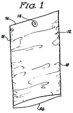
| This SUPER PAC also provides
some additional information on the packaging material and
process, thanks to a printed line of text on the
polybag's lower left hand corner which refers to a
registered trademark (REDI-RAK) and a U.S. patent number
(3.308.660). |
| |
|
| |
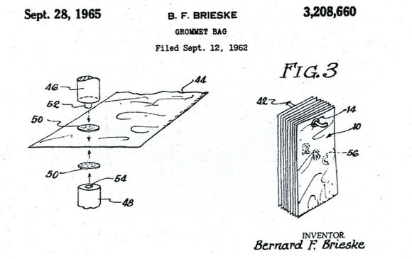
| The patent concerned was filed in 1962 and registered
in 1965 by Bernard F. Brieske, who registered a number of
US patents in conjunction with the production and usage
of packaging items (such as polybags), in conjunction
with Illinois-based Vision Wrap Industries (who had the
Redi-Rak name trademarked in 1969). Only a small handful
of SUPER PAC polybags carry that reference. |
| |
| The patent "is
particularly directed to bags or similar
containers which are formed of polyethylene and
which are provided with grommets whereby the bags
can be effectively employed for rack
merchandising and for similar uses". As
such, this system would do away with any added on
hanging labels (as seen on the very first
generation of DC Comicpacs) as these would become
an integral part of the packaging.
The patent
also illustrates how the polybags were filled
from the bottom:
"Where (...) sections [of
polyethylene] are employed, a heat seal is
provided along the end of the bag which has
the grommet adjacent thereto. In the normal
course, the package manufacturer will market
a bag of this type with an open end whereby
the persons interested in using the bags can
heat seal or otherwise close off this end
when the goods are inserted in the bag. For
display purposes, the grommet end of the bag
would then become the top of the bag."
|
|
 |
|
| Many important questions still remain open regarding
the packaging of comicpacks (most importantly where it
was done and by whom), but this little snippet of
information on the polybag of the C-12 December 1972 SUPER PAC at least sheds a
little bit of light on this aspect. |
| |
|
| |
|
|
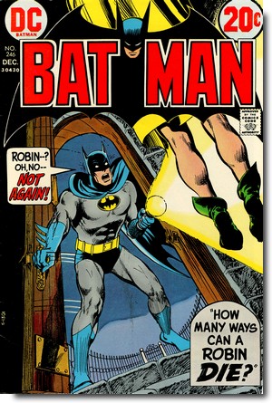
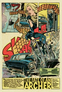
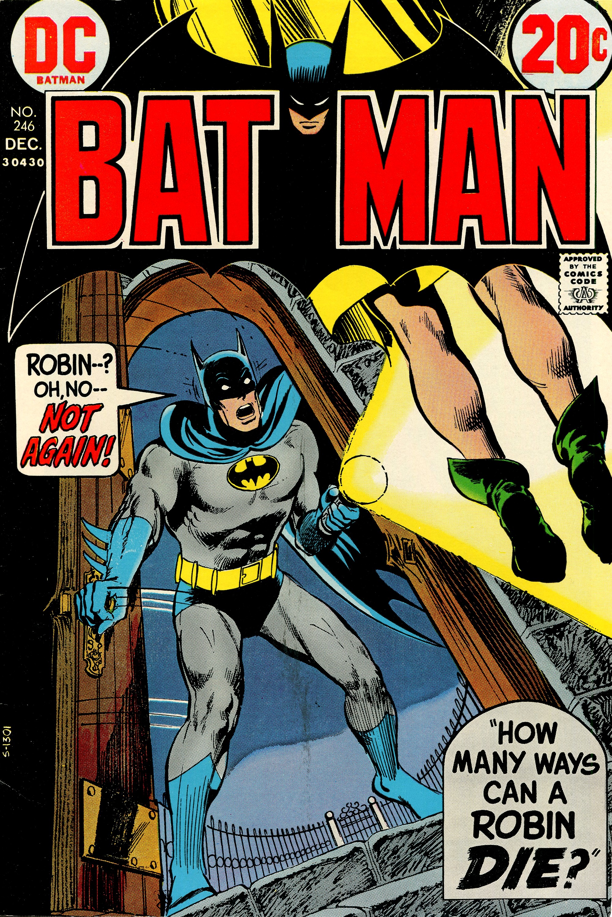
BATMAN
#246
December 1972
(monthly,
with the exception of January,
March, July and November)
On Sale:
19 October 1972
Editor
- Julius Schwartz
Cover - Dave Cockrum (pencils) & Neal
Adams (inks)
"How Many Ways Can a
Robin Die?"
(22.5 pages)
Story -
Frank Robbins
Pencils - Irv Novick (pg 1-17), Dick
Dillin (pg 18-23)
Inks - Dick Giordano
Lettering -
Ben Oda
Colouring - NN
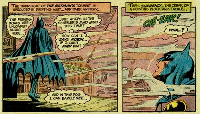
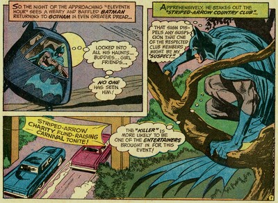
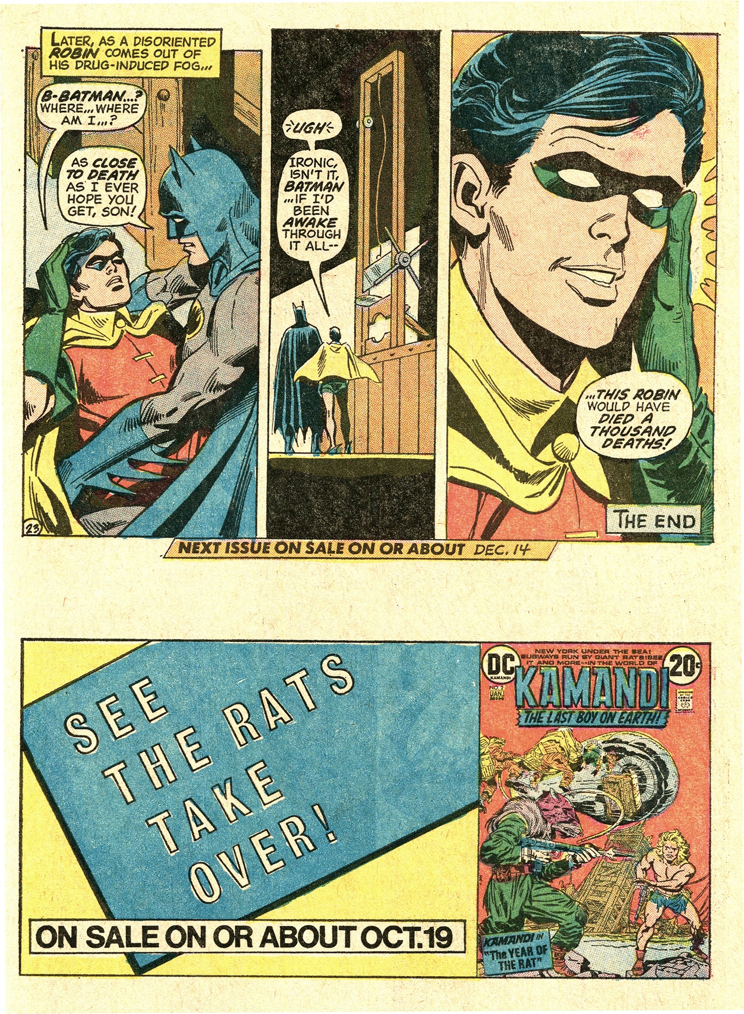
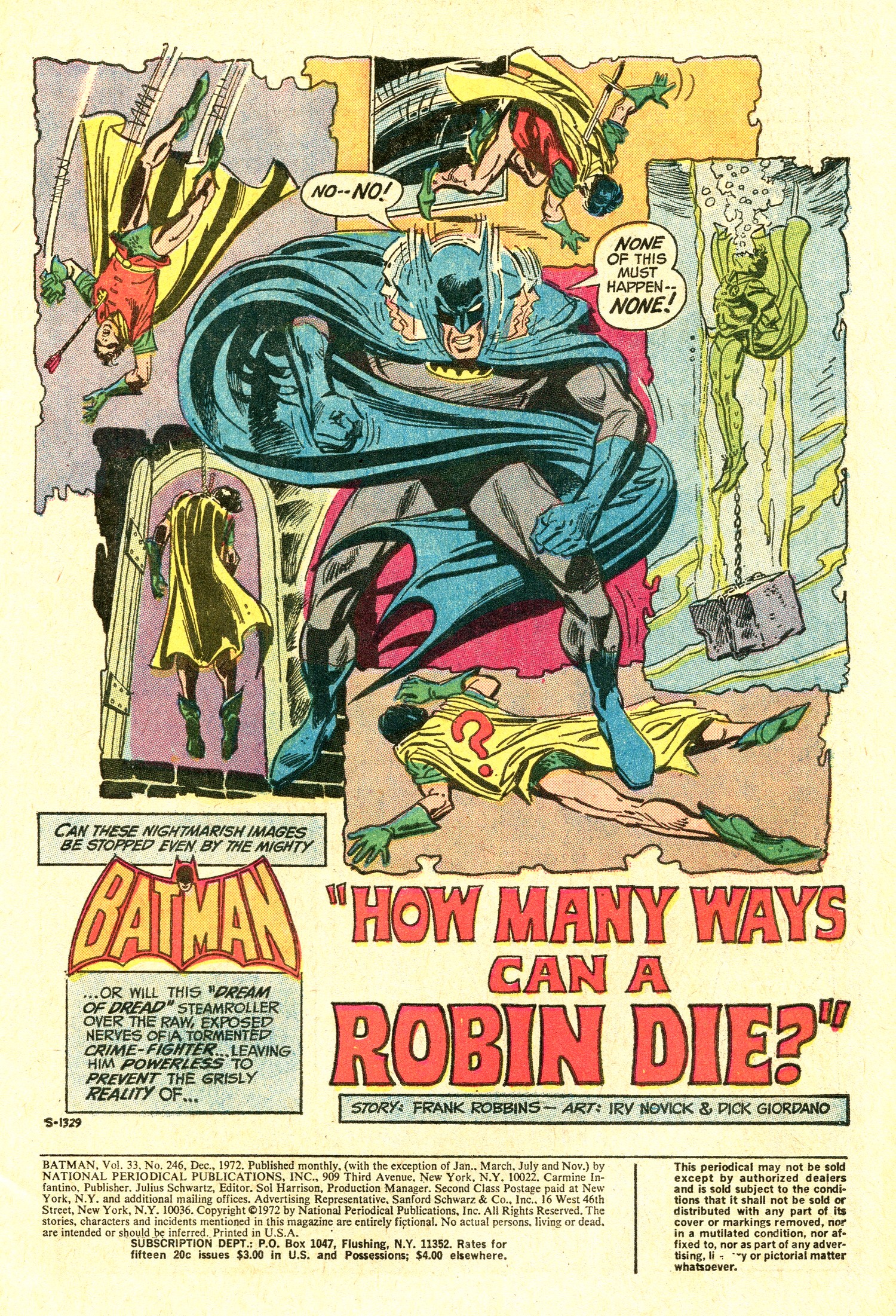
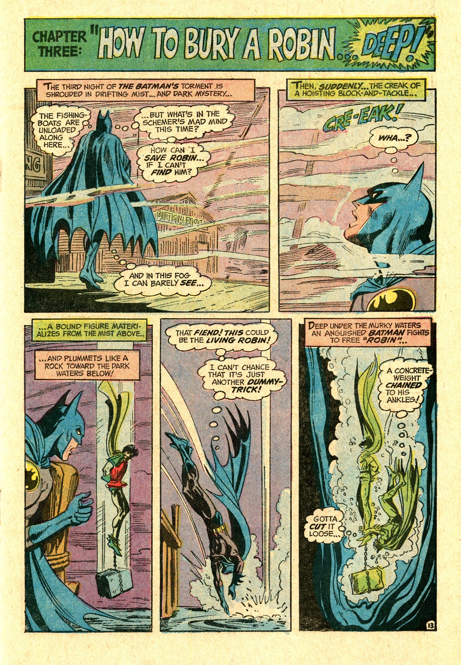
PLOT
SUMMARY - Someone is
demonstrating ways to "kill"
Robin by using dummies and is thus
psychologically torturing Batman, who
must track down further dummies and hope
he will be in time to rescue the real
Robin from the hands of a twisted killer.
|
|
|
| |
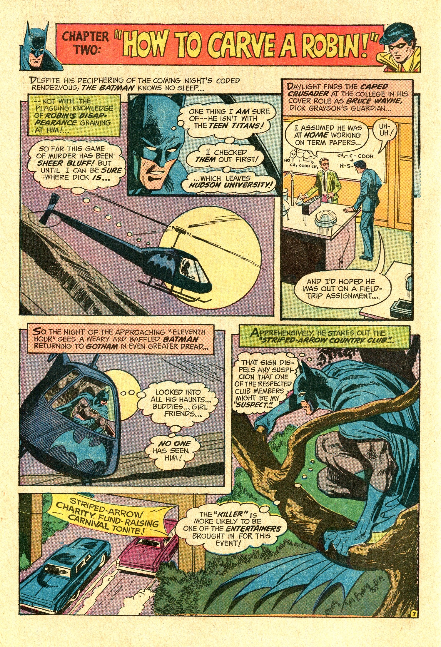
| Batman #246 follows on
the heel of a three issue run by Denny O'Neil /
Neal Adams (including a two-issue story in which
Batman tracks Ra's Al Ghul to Switzerland) and
presents readers with some very noticeable
changes. First off, Frank Robbins spins yarns
very differently than O'Neil does, and the
artwork of this issue is even split up between
two pencillers, Irv Novick and Dick Dillin.
Robbins (1917-1994) took over writing the
Batman in 1968 from Gardner Fox, who had
essentially been pouring out stories featuring
Bruce Wayne and his vigilante alter ego since
1939.
After a transition phase (the "camp"
TV show was gone but things were still very much
tongue in cheek), Frank Robbins initiated the
character's return to his darker, more gothic
roots before O'Neil and Adams ran with it.
|
|
 |
|
 |
|
| |
| "How Many
Ways Can a Robin Die?" may explain why
writer-artist Robbins is identified and remembered less
with Batman's transition to a darker place than is the
case with O'Neil and Adams. On its surface, the story -
divided up into no less than five chapters, all of which
sport borderline goofy titles - seems to have more in
common with the often ludicrous Batman stories from the
1950s and 1960s than with the Darknight Detective tales
from the 1970s. |
| |
|
| |
| As light-heartedly as it may be portrayed, Batman is
actually trying hard to prevent his sidekick from being
killed - in most gruesome ways, no less. And once he
catches up with the perpetrator, he lets him know that "I
am always prepared to die (...) but not at the hands of
rabid dogs like you." Those aren't just words
that Robbins has the Batman say; the Darknight Detective
does indeed view the psychopathic criminal as something
below human - which of course questions Batman's humanity
just as much in return. It is a return to the mindset of
the Batman of 1939 who threw criminals off of roofs. And
with that state of mind, with an anger barely controlled,
the Darknight Detective goes off like this on Ravek
because the criminal knew exactly how to play the Batman:
push his guilt buttons, and if Robin were to die, the
Darknight Detective would have psychologically imploded.
Ravek understood the Batman's secret weakness, and
Robbins give the readers a glimpse into a very dark
abyss, and a person only barely - and very delicately at
that - balanced.
|
| |
 |
|
It is entirely
possible to read over those aspects and be left
with what then almost feels like a send-off of
those camp Batman tales. It actually works both
ways, which is a credit to Robbins.
It also works because Irv Novick
and Dick Dillin (for the conclusion) both provide
solid atmospheric artwork that reflects and
supports both the Saturday matinée
cliffhanger take and the far less optimistic
noir aspects of the story.
|
|
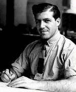
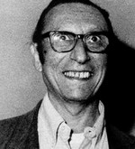
Irv Novick
|
|
| |
| Novick (1916-2004) graduated from the National
Academy of Design in New York City and, following a brief
stunt at the illustrator's studio of Harry Chesler in
1939, went on to spend almost his entire career in the
comic book industry. In the mid-1960s DC Comics offered
him an unprecedented freelance contract which guaranteed
him the highest artist's rate plus a steady amount of
work. In essence, this meant that as soon as Novick had
finished a job he was to immediately receive another
assignment - which explains his substantial body of
artwork for DC over the years. |
| |
| When Carmine
Infantino became a part of DC's
management in 1968 he made sure
that Novick became a full-time
superhero penciller, thus
providing the artwork for most of
DC's top titles of the genre,
including numerous contributions
to Batman and Detective
Comics. Irv Novick had a
substantial part in shaping the
visuals of Batman during the late
1960s and all throughout the
1970s. Retaining his very own
style, he (together with a few
other pencillers) fleshed out the
popular culture icon look which
Neal Adams had created, and left
a lasting contribution to the
hallmark appearance and visuals
of the Darknight Detective -
which still remain iconic to this
day.
His pencils had a classic
touch in the best sense of the
word, and his pictorial
storytelling was fresh and
dynamic and even made some of the
lamer plots of the Bronze Age
look interesting.
|
|
 |
|
|
|
| |
 |
|
With a little bit
of luck, regular buyers of DC's
SUPER PACs would be able to pick up
the next issue of Batman
too - as
Batman #246
would be contained in the 1973
B-2 SUPER PAC (albeit
slightly hidden as the middle
comic book). |
|
|
|
| |
| |
|
| |
|
|
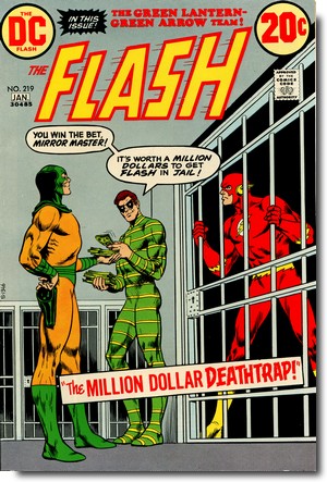
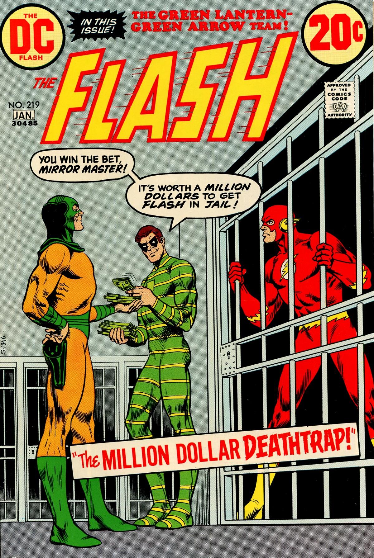
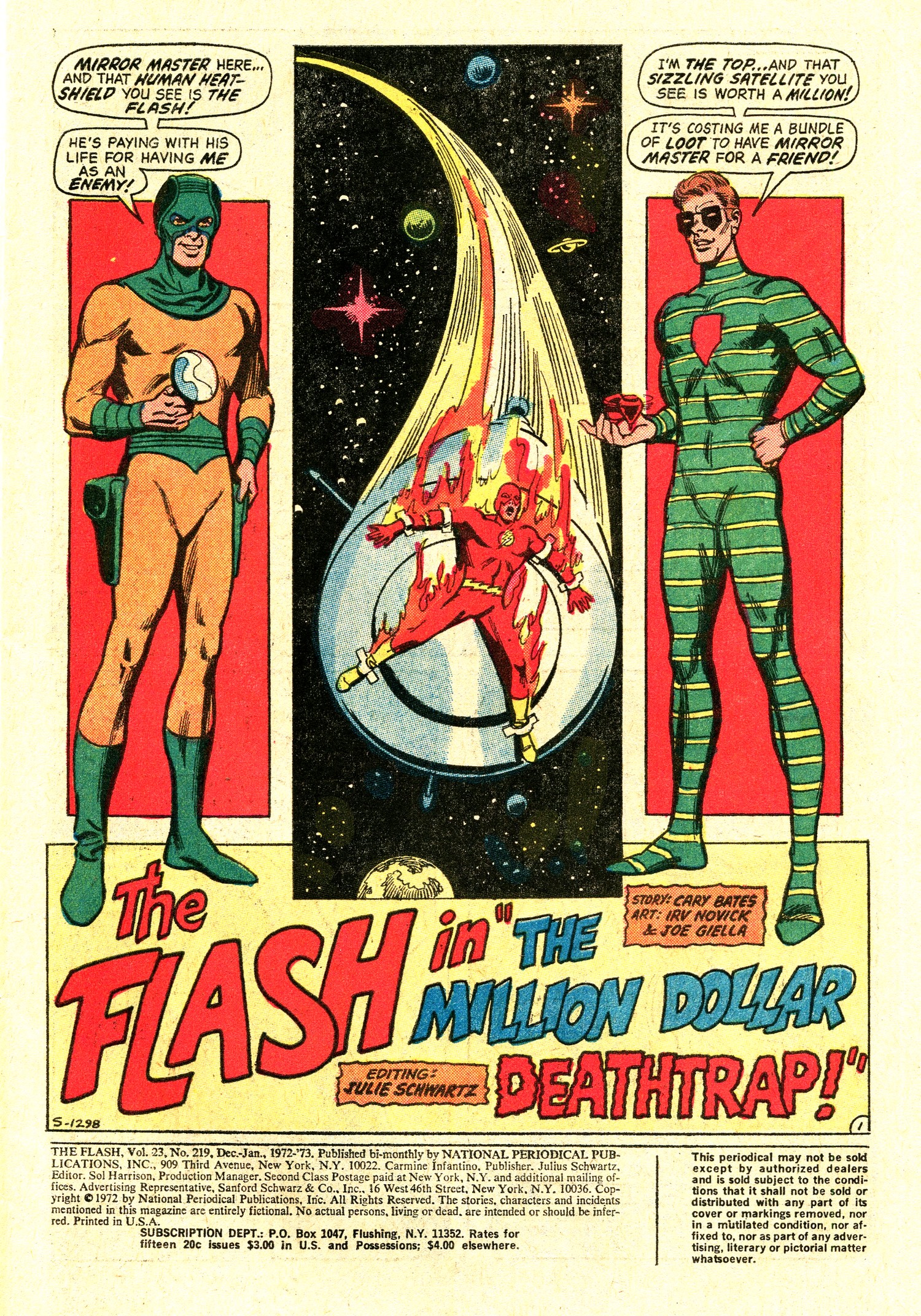
FLASH #219
December/January
1972/73
(bi-monthly)
On Sale:
17 October 1972
Editor - Julius
Schwartz
Cover - Nick Cardy (pencils &
inks)
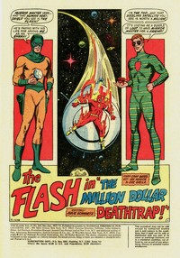
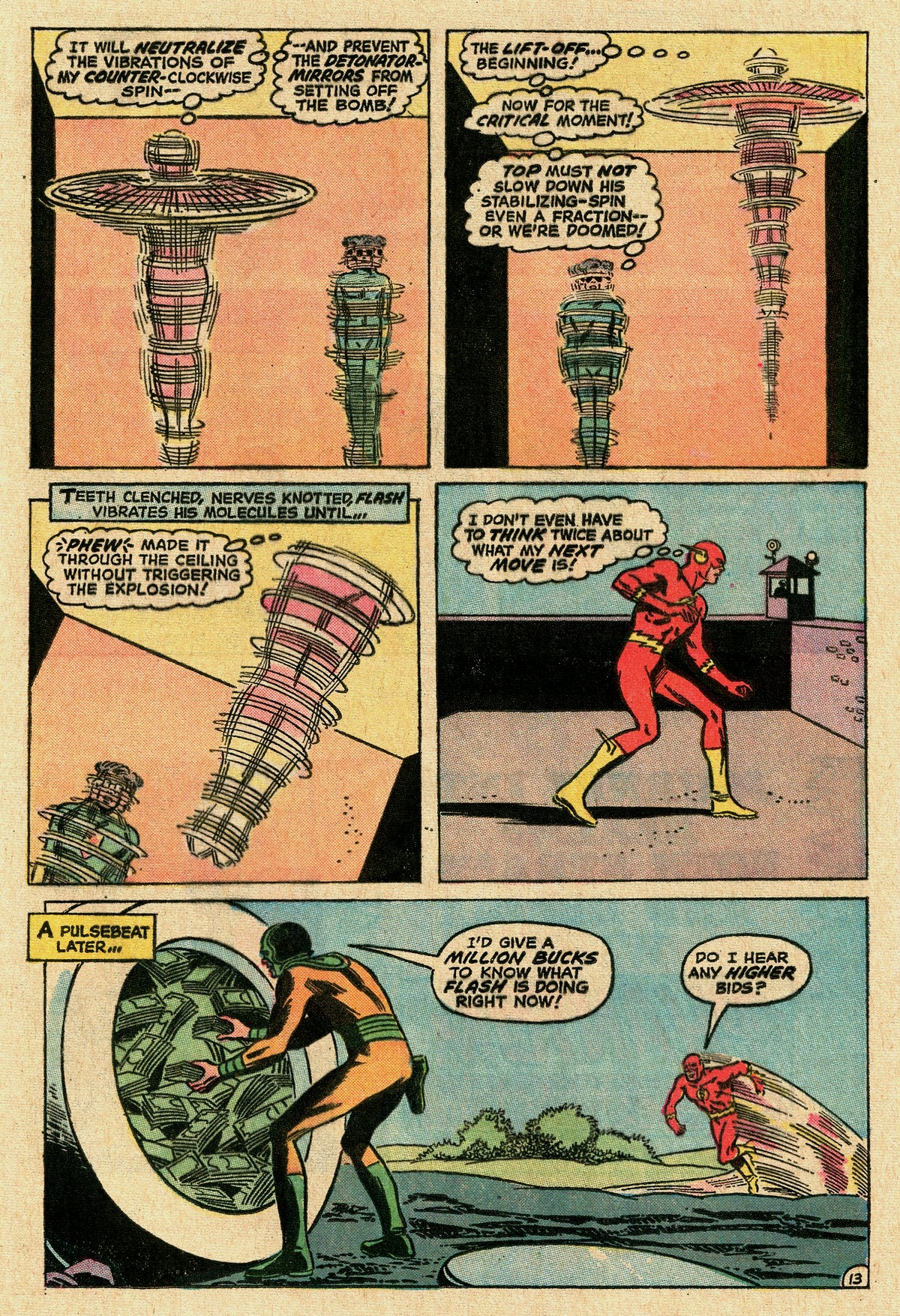
FLASH:
"The Million
Dollar Deathtrap"
(13.5
pages)
Story
- Cary Bates
Pencils - Irv Novick
Inks - Joe Giella
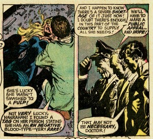
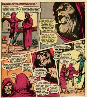
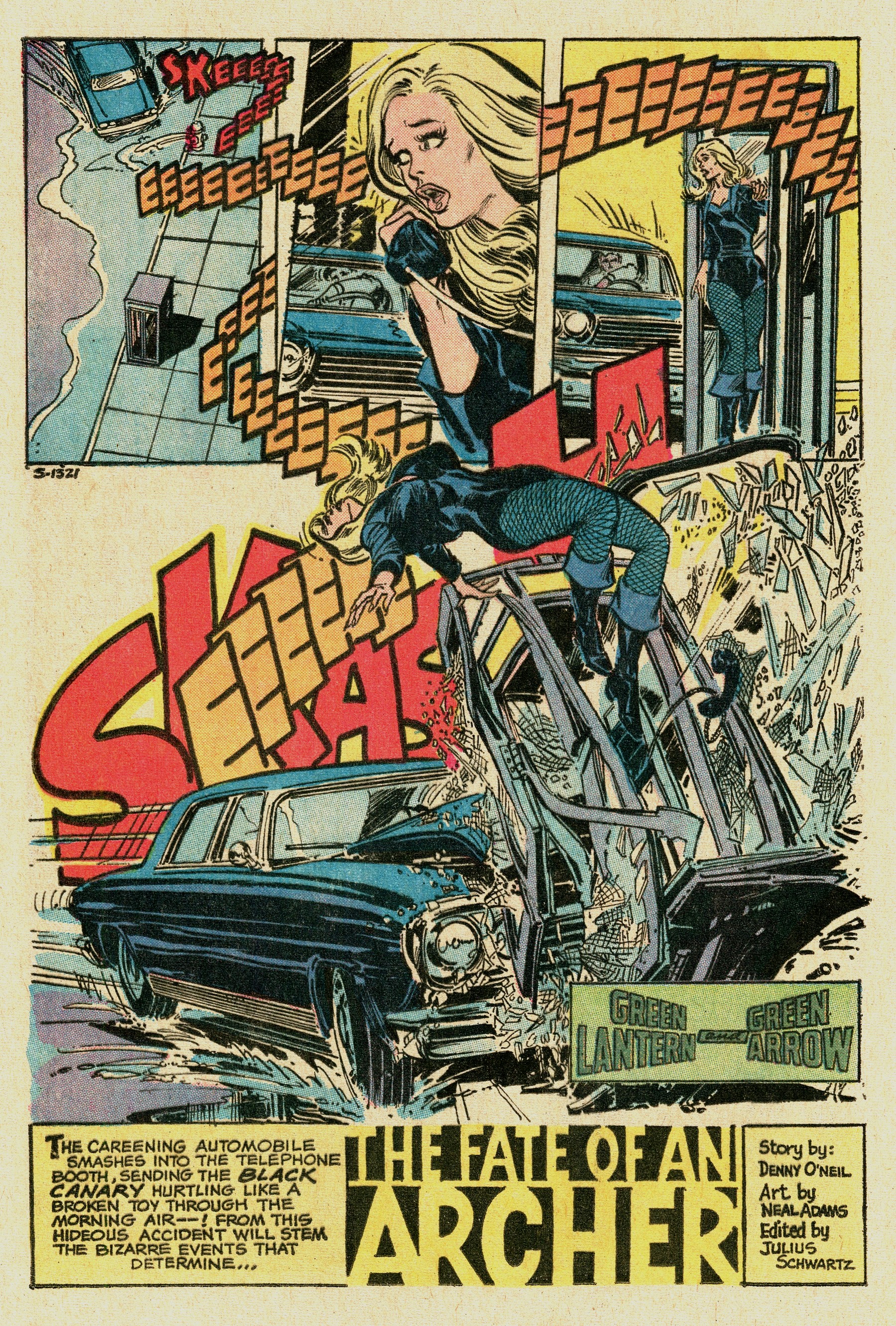
GREEN
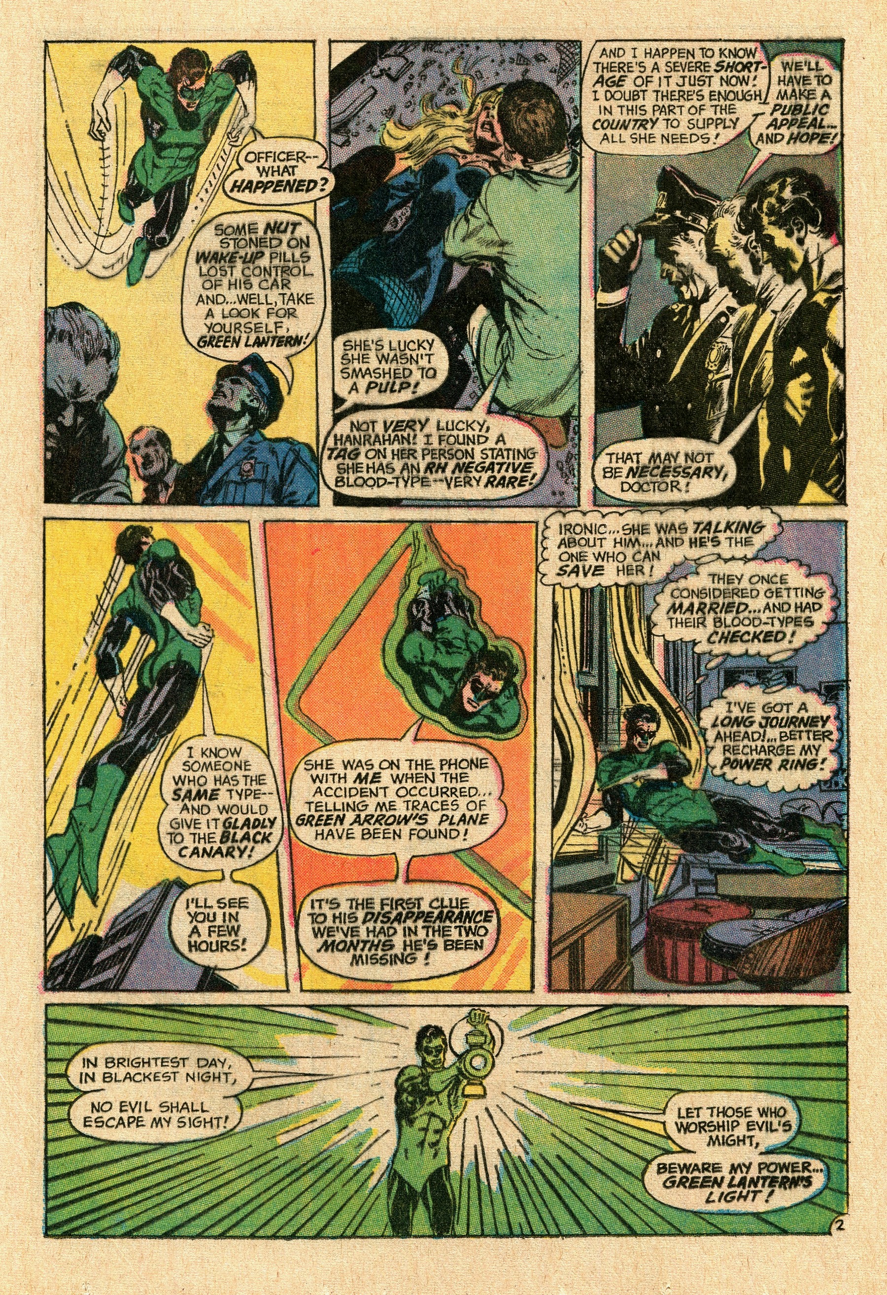
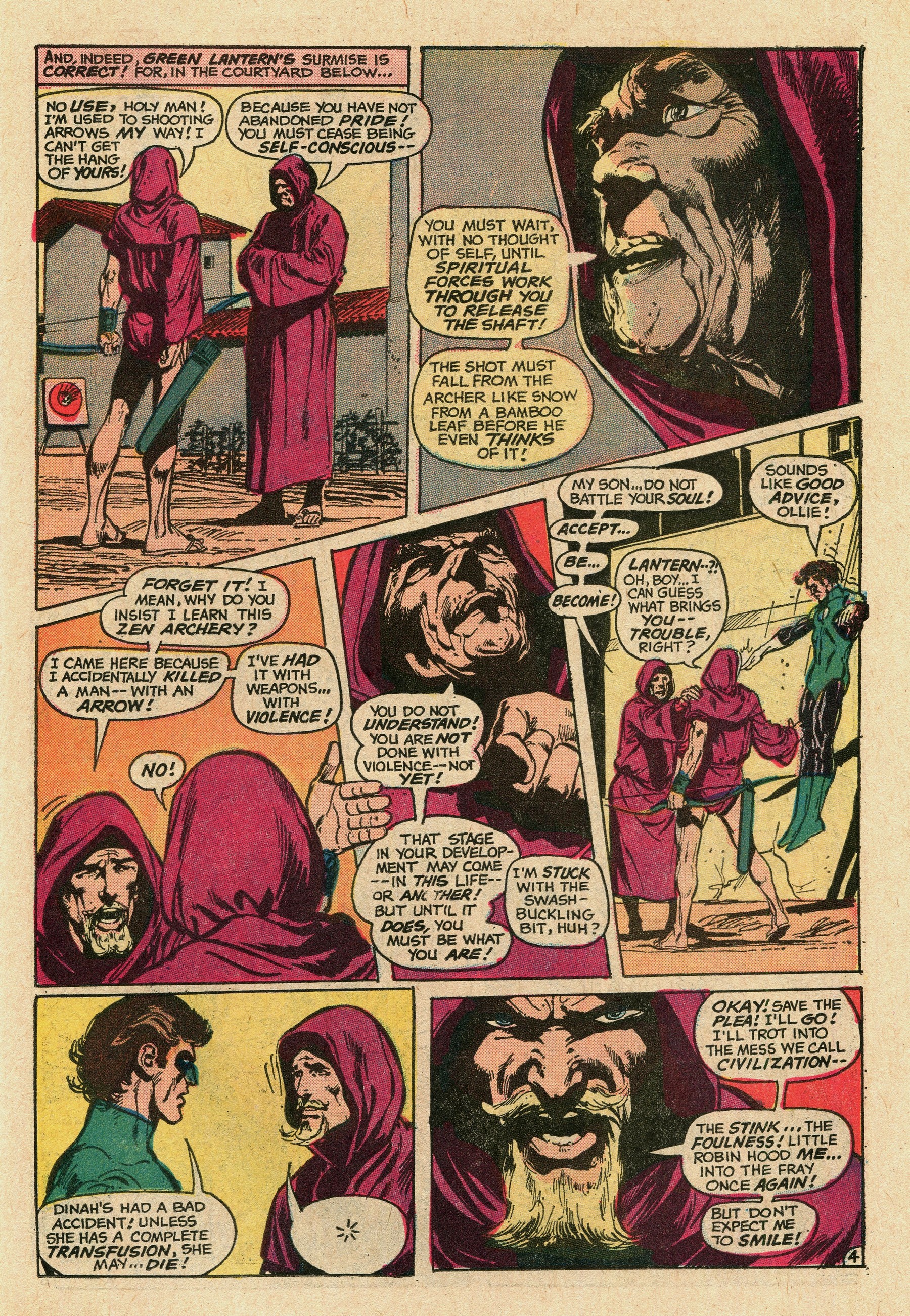
LANTERN & GREEN ARROW: "The
Fate of an Archer"
(9.5
pages)
Story
- Denny O'Neil
Pencils - Neal Adams
Inks - Neal Adams
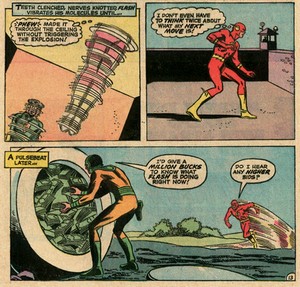
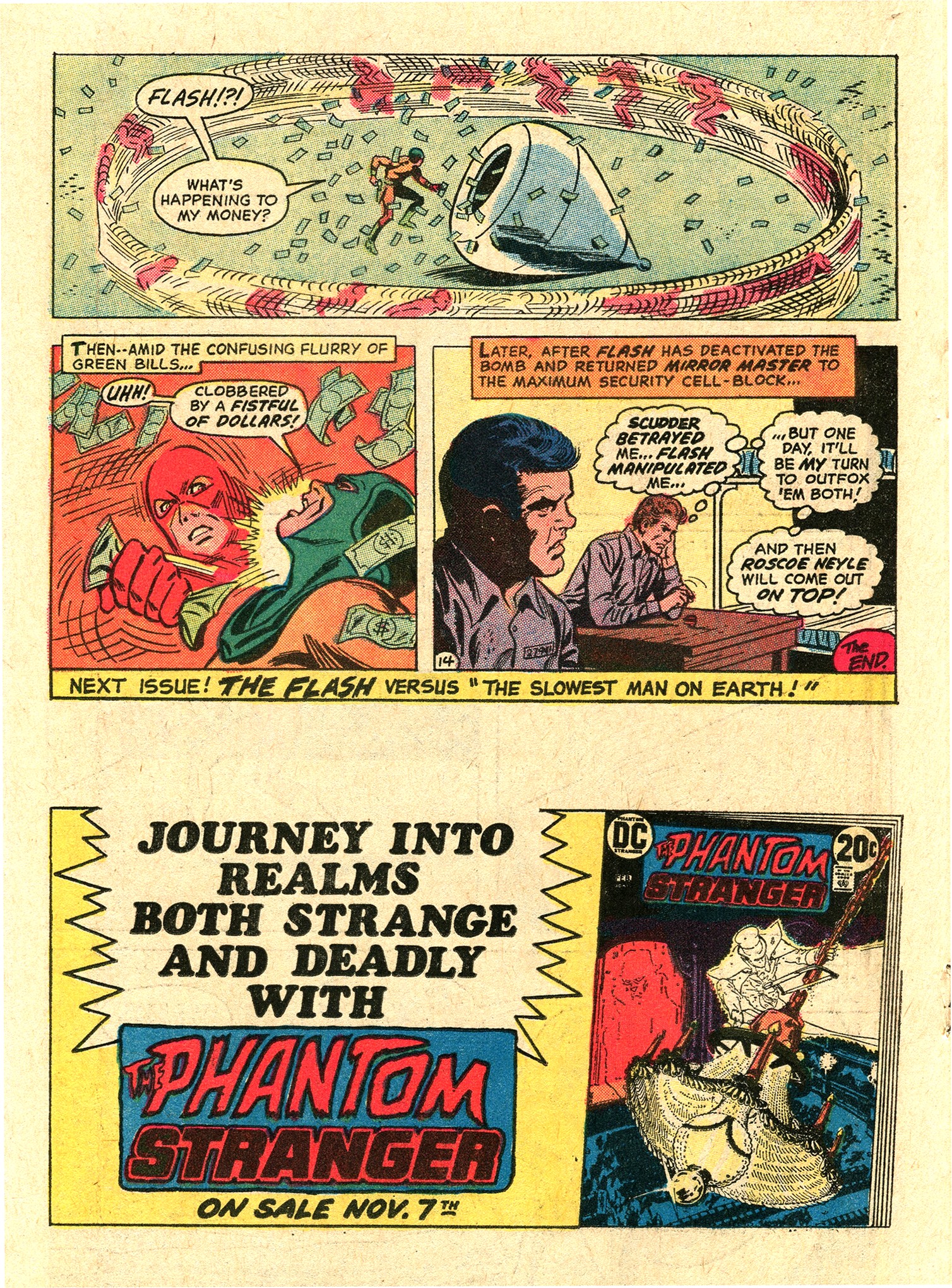
PLOT
SUMMARIES - The
Top makes a million-dollar bet
with Mirror Master that he cannot
escape prison and destroy the
Flash with his optical weapons,
and the Mirror Master takes him
up on it. / After Black Canary is
hit by a car she urgently needs a
blood transfusion. Green Arrow
shares her rare blood type, so
Green Lantern sets out in search
of the archer.
|
|
|
|
| |
| The Flash was a
regular title in DC's SUPER PACs, and although
its
namesake character is a mainstay in the DC Comics stable,
the series has been cancelled and restarted several
times. |
| |
| The first volume, starring Barry
Allen as the Flash, picked up the numbering of
the original Flash Comics with issue #105
(March 1959) and ran until issue #350 (October
1985). In one of DC's first (and often
confusing) switches in alter egos, Barry Allen
would then die in Crisis on Infinite Earths
and Wally West, Allen's sidekick Kid Flash, took
up his uncle's mantle as the Flash. Somewhat
similar to Batman's sidekick Robin, DC now sports
several different Flashes, depending on what
volume of the title (and possibly what parallel
DC universe) you're looking at.
Flash #219 features the original DC
Flash, as well as his first ever villain, Mirror
Master (whom he encountered in his first
adventure, back in Flash #105), together
with The Top - and the overall result actually
looks and feels like an early 1960s comic book
story, rather than one from 1972.
|
|
 |
|
 |
|
| |
Comic book publishers with established and popular
characters have traditionally strived to ensure that
their visuals remain identical. Disney has always had a
very strict "house style" policy in that
respect, instructing artists in great detail how to draw
its characters, because Mickey Mouse and Donald Duck and
all the others should always look the same, regardless of
the creative talent involved. A similarly strict policy
was in place at DC Comics.
"DC artists were forced to work within an
established house style that governed the page layout
as well as the look of the artwork. Editor Julie
Schwartz's motto was 'if it's not clean, it's
worthless'." (Tucker, 2017)
|

Carmine
Infantino
(1925 - 2013)
|
|
When Carmine Infantino was
appointed DC's art director in 1967, he eased the
rules a bit in an attempt to make DC a more
welcoming place for talented artists. But general
management at DC still felt that their "safe
and polished" house style was actually
sophisticated (and more refined than anything
Marvel would ever put out), and therefore had it
continue for some characters, including the Flash
(whom Infantino had, somewhat ironically,
pencilled for years following the superhero's
relaunch in 1956). Years later, looking back to
the late 1960s and early 1970s, and reflecting on
his promotions to DC's Editorial Director in 1967
and then DC's Publisher in 1971, even Carmine
Infantino himself had to admit that
"The DC books were very
sterile-looking in those days."
(Infantino & Spurlock, 2001)
|
|
| The Flash story in Flash #219 seems like an
excellent illustration of Infantino's thoughts since,
incredible as it may seem, the penciller at work here is
the same who drew most of the Batman issue also
to be found inside this SUPER PAC: Irv Novick. |
| |
| The difference,
induced by the house style for
the Flash at the time, is
striking. It is safe to assume
that Novick simply adapted to
what was expected from him,
depending on the title, but even
if he did add more detailed
backgrounds the inker would
simply override that - especially
since the inker on this issue was
Joe Giella.
Born in 1928, his inking style
became synonymous with DC's house
style. Being the final step in
the production of the artwork
besides colouring, inkers such as
Giella were in a position to make
sure that the rules of the house
style were adhered to - an
experience even Carmine Infantino
recalled from back when he was
"just" a penciller for
Batman:
"Remember, once I
turned in the drawing, I had
nothing more to say (...)
Giella had the house style
then. It was a very slick
look, and I wasn't fond of
it, but it was the house
style." (Infantino
in Eury & Kronenberg,
2009)
|
|
 |
|
|
|
The "slick look" resulted in artwork that
generally featured very little detail and more often than
not just blank or highly reduced backgrounds. It was an
approach that didn't do justice to the artwork of many
pencillers.
"[Gene Colan's 1950s] art was buried in
the DC house style inking of people like Frank Giella
and Sy Barry." (Apeldoorn, 2013)
|
| Some creative teams were able to fight off this
reductionist policy, mostly due to either working on a
failing character or title, or thanks to being fan
favourites. |
| |
 |
|
Neal
Adams and Denny O'Neil
clearly belonged to the
second group in 1972, and
so in spite of Julie
Schwartz being the
editor, Adams was able to
pursue his own style
without restrictions -
not the least due to the
fact that he inked his
own pencils. It seems
almost impossible to
imagine a starker
contrast in telling a
story through words and
images than the one
readers of Flash
#219 experienced - in
seeing O'Neil and Adams
tell a Green Lantern and
Green Arrow yarn as
compared to Bates and
Novick doing the same for
the Flash on the
preceding pages. The two
end results seemed to
come from entirely
different eras.
The impact Adams
visual approach had on
some of DC's main
characters (resulting in
an implicit new
"house style"
for Batman) is common
knowledge.
|
What
is less talked about is how the
powers in charge at DC reacted to
the fans embracing the change
both in artwork and how the
character was handled.
"I
had asked to work on Batman
many times and [Julie
Schwartz) turned me down. So
I drew Batman for several
issues of Brave and the Bold.
Letters poured into DC Comics
saying and asking "Why
is the only 'good' Batman the
one in Brave and the
Bold?" Under this
barrage of fan mail Julie
finally offered to let me
draw for the regular Batman
titles. In our hallway chat,
as he offered me the Batman
work, Julie finally said, and
with some annoyance,
"Why is it, Neal, that
you think you know how to do
Batman and all the rest of us
don't?" What I said to
Julie at the time (...) is
that it's not that I knew
what Batman should be, it's
that I and every kid in
America knew what Batman
should be." It just
didn't seem like the people
at DC Comics knew what Batman
ought to be." (Neal
Adams in Eury &
Kronenberg, 2009)
One look at the
page composition and complexity
of the artwork of "The Fate
of an Archer" embedded in Flash
#219 is enough to understand that
this didn't just apply to Batman.
|
|
|
|
|
|
| |
| The fact that readers of Flash even got to
see this was due to the faltering success of
Green
Lantern. Sales had been in a major decline for years,
and even the O'Neil/Adams stories that co-starred him
with Green Arrow ultimately failed to save the title,
which was cancelled with issue #89 (April/May 1972). The
end of the story arc of the Green Lantern/Green Arrow
series was therefore published as a back-up feature
starting in Flash #217 and ending in this issue,
#219. Prior to Flash #217 the back-up story had
featured Kid Flash, starting with Flash #220 that
spot would be given over to the solo adventures of Green
Lantern up until issue #244 (September 1976) when the
title (now reduced to a page count of 17) would drop
back-up features. |
| |
| |
|
| |
|
|
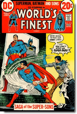
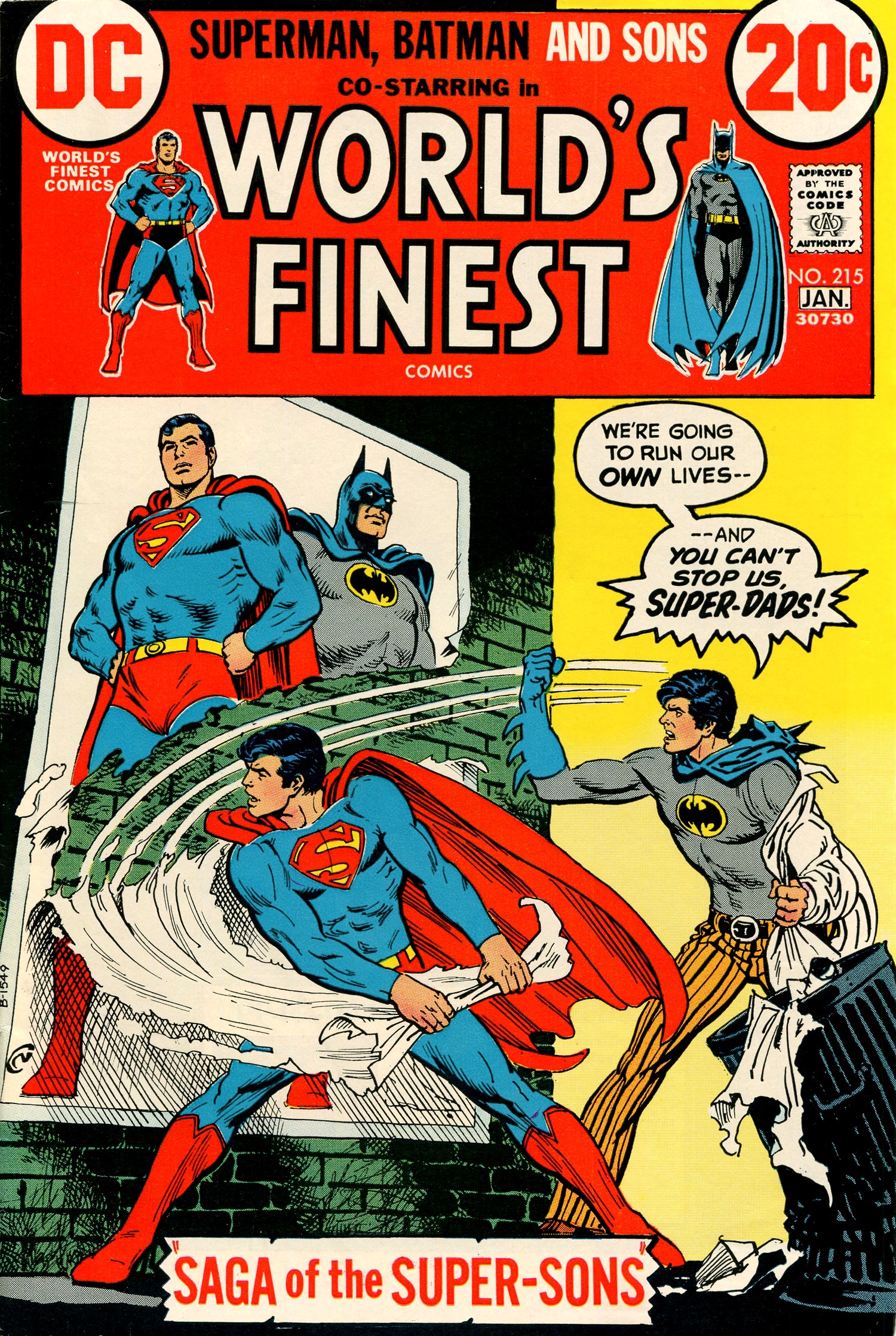
WORLD'S
FINEST #215
December/January
1972/73
(bi-monthly)
On Sale:
17 October 1972
Editor - Murray
Boltinoff, E. Nelson Bridwell
(assistant)
Cover - Nick Cardy (pencils &
inks)
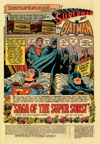
"Saga
of the Super Sons!" (23.5
pages)
Story - Bob Haney
Pencils - Dick Dillin
Inks - Henry Scarpelli
PLOT
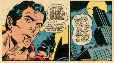
SUMMARY - Superman
and Batman are having
increasingly heated discussions
with their teenage sons about
their roles. When Superman
creates an alternate timeline and
reality in Sparta City, Superman
Jr. and Batman Jr. can explore
crime-fighting without
ramifications yet still put an
end to the local mob boss, albeit
with some unexpected help.
|
|
|
|
| |
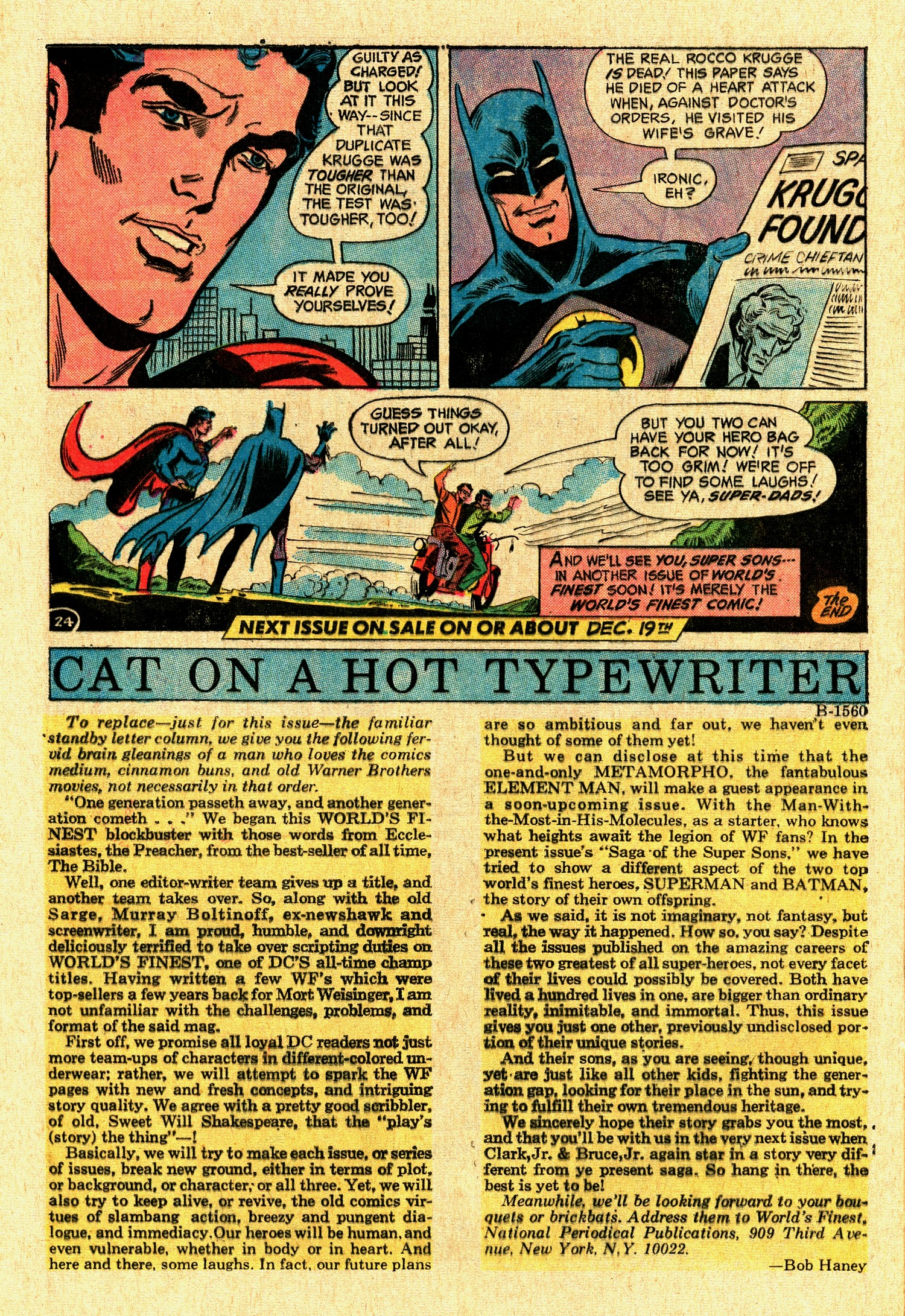
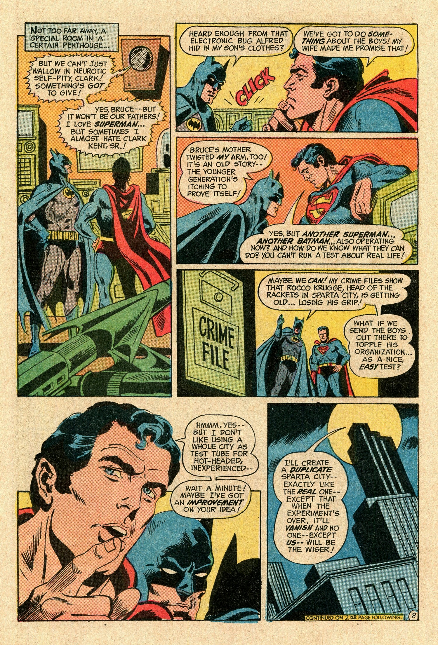
Did you ever wonder if one day Superman
and Batman had Sons...
what they would be like??
Heroic Chips off the Old Blocks -- or Super Duds? Wonder
no more, Faithful Ones!
Imagination? Put-On? No! For now, here, revealed in all
its Shock and Human Anguish,
the sensational top-secret
World's
Finest Story that cried out to be
told..."Saga of the Super Sons!"
If this (Superman and
Batman aside) sounds a lot like Marvel and not at all
like DC, then it's because of the writer - Bob Haney.
|
| |
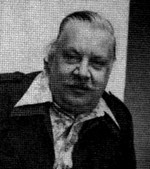
| Robert G. "Bob" Haney
(1926-2004) started working in the comic book
industry in 1948 and joined DC in 1954, where
over the next 30 years he scripted just about
every sort of comic book DC published (Evanier,
2004). Sometimes called "Zany"
Haney, he was in actual fact one of the few
people at DC in the mid-1960s who
"understood that Marvel was
successfully reinventing the super-hero comic
for the current generation"
(Evanier, 2004)
Haney almost desperately tried to bring some
of that "Marvel flavour" to the stories
he was writing for DC, and that included his very
own (and sometimes completely off-beat) version
of Stan Lee's hyperbole - as illustrated by his
introduction to "Saga of the Super
Sons".
|
|
 |
|
 |
|
| |
| But Haney understood that readers expected the
writers of the comic books they were buying to connect
with them, and whilst he could not make DC look like an
exclusive secret club the way Marvel portrayed itself,
addressing readers as "faithful ones" was
definitely a step in the right direction. |
| |

Bob Haney
|
|
He was also keenly aware
of the fact that the content itself had
to change, and his vehicle for that was
the Batman team-up series Brave and
the Bold.
"I wanted the spooky dark
night Batman image of his original
days. Such artists as Neal Adams and
the redoubtable Jim Aparo brought
this vision to panelled
reality." (Bob
Haney, in Best of the
Brave and the Bold #5, 1988)
Haney cared very little about the
conventionalities of the DC Universe and
would sometimes even write stories which
outright contradicted them - so much so
that Haney's Brave and the Bold Batman
would be deemed to be living in an
alternate reality called
"Earth-B" (Eury, 2013).
Haney could whip up tightly plotted
scripts (e.g. his classic Brave and
the Bold stories illustrated by Neal
Adams) just as easily as throwing out
extremely loose plots with lots of holes
and very little overall sense.
|
|
|
| |
| The "Saga of the Super Sons" sits
somewhere between those two poles, especially
since it features an interesting "what
if" scenario in the premise of both Superman
and Batman having a son, even though the
"what if" concept as such was not new.
DC published a number of stories, particularly
during the 1960s, which did not take place in the
regular continuity of the featured character.
Most of these stories were labelled
"imaginary stories" and featured
alternate histories, mostly concerning Superman.
In this case, however, both the introduction and
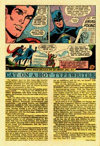
the added explanatory notes ("Cat on a hot
typewriter") by Bob Haney made it clear that
the Super-Sons were actual stories from the lives
of Superman and Batman. |
|
| |
 |
|
Richard
Allen "Dick" Dillin (1928-1980)
was in charge of pencils (as he had been
for the conclusion of Batman
#246), inked by Henry
Scarpelli (1930-2010, who is more noted
for his work for Archie Comics), and the
resulting artwork has a conventional
layout and a very clean look to it - even
in the dynamic renderings of the action
sequences. Clearly, DC's antiquated house
style was starting to give way to what
was still a very conservative style but
one that at least could be seen as being
in step with its time.
|
|
Dick Dillin
|
|
|
| |
| The Super-Sons would make subsequent appearances in World's
Finest #216, 221-222, 224, 228, 231, 233, 238 and
242, all scripted by Bob Haney. In World's Finest
#263 (July 1980) Denny O'Neil explained the Super-Sons'
existence as the result of a computer simulation, created
by Superman and Batman on the Man of Steel's computer in
his Fortress of Solitude. |
| |
| |
|
| |
| FURTHER
READING ON THE THOUGHT
BALLOON |
| |
| |
 |
|
"Comic
packs" not only sold well
for more than two decades, they
also offer some interesting
insight into the comic book
industry's history from the 1960s
through to the 1990s. There's
more on their general history here. |
|
|
|
| |
| |
|
| |
BIBLIOGRAPHY
| |
| |
| APELDOORN
Ger (2013) "Hopping Along", published
online 6 October 2013 at Fabulous Fifties EURY
Michael & Michael Kronenberg (2009) The
Batcave Companion,
TwoMorrows
Publishing
EURY Michael (2013) "The
Batman of Earth-B", in Back Issue #66
(August 2013), TwoMorrows Publishing
EVANIER
Mark (2004) "On the Passing of Bob
Haney",
published online 7 December 2004 on News from
Me
EVANIER Mark (2007) "More
on Comicpacs", published online 2 May
2007 in News From Me
TUCKER Reed (2017) Slugfest:
Inside the Epic Fifty-Year Battle between Marvel
and DC, Sphere
WELLS John (2012) American
Comic Book Chronicles: The 1960s (1960-1964),
TwoMorrows Publishing
|
|
| |
| |
|
| |


|
| |
|
| |

(c) 2022
uploaded
to the web 15 January 2022
|
| |
|
| |
|


